
Table of Contents
- Introduction: Why Typography Matters in Branding
- The Role of Typography in Brand Identity
- Establishing Brand Personality
- Building Emotional Connections
- Key Typography Elements That Influence Branding
- Font Style & Personality
- Readability & Accessibility
- Consistency Across Platforms
- Typography in Branding Strategies
- Choosing the Right Font for Your Brand
- Typography and Visual Hierarchy
- Typography in Digital vs. Print Branding
- Real-World Examples of Typography in Branding
- Recommended Fonts for Branding from RaisProject
- Best Practices for Using Typography in Branding
- Conclusion
- References
1. Introduction: Why Typography Matters in Branding
Typography in branding is one of the most powerful yet often overlooked elements of design. More than just choosing a stylish font, typography directly shapes how customers perceive your brand identity, personality, and values. The right font choice can communicate professionalism, playfulness, elegance, or boldness, making typography a silent ambassador for your business.
2. The Role of Typography in Brand Identity
Establishing Brand Personality
Fonts have distinct personalities. A bold sans serif font conveys strength and modernity, while a script font adds elegance and creativity. Typography bridges the gap between your business’s values and how your audience perceives them.
Building Emotional Connections
Typography influences emotions. For example, a playful handwritten font can spark feelings of friendliness, while a clean geometric font creates professionalism. The emotional layer of typography makes your brand memorable.
3. Key Typography Elements That Influence Branding
Font Style & Personality
Fonts carry meaning:
- Serif fonts = trust, tradition, authority.
- Sans serif fonts = modern, clean, approachable.
- Script fonts = elegance, creativity, human touch.
- Display fonts = bold, attention-grabbing, unique.
Readability & Accessibility
No matter how stylish a font looks, readability is crucial. Your typography should adapt to different screen sizes and remain clear across platforms.
Consistency Across Platforms
Consistency strengthens brand recognition. Using the same typography across your website, packaging, and social media creates a cohesive identity.
4. Typography in Branding Strategies
Choosing the Right Font for Your Brand
When selecting typography, consider your audience. For a luxury beauty brand , an elegant serif font might be best. For a kids’ toy store , a playful handwritten font communicates joy and fun.
Explore examples on RaisProject:
- Ocean Drive Brush Font– Playful and cute, perfect for lifestyle and kids’ brands.
- Royal Estelle Font– Elegant and classy, ideal for premium and beauty branding.
- Bitter Pastry Font– Strong and textured, great for food & beverage branding.
Typography and Visual Hierarchy
Typography helps guide the viewer’s attention. Large, bold headlines grab attention, while smaller text communicates details. Using contrast in size, weight, and spacing can establish a clear hierarchy.
Typography in Digital vs. Print Branding
Digital branding requires responsive fonts that look sharp on screen, while print branding focuses more on texture and detail. Choosing web-safe fonts ensures online consistency.
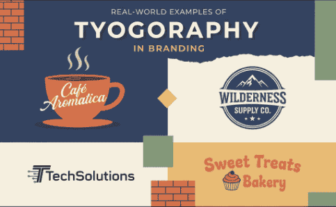
5. Real-World Examples of Typography in Branding
- Coca-Cola uses flowing script fonts to communicate friendliness and tradition.
- Apple embraces minimal sans serif fonts for sleekness and innovation.
- Disney relies on playful typography to spark nostalgia and joy.
These examples prove that typography is not just decorative—it’s strategic.
6. Recommended Fonts for Branding from RaisProject
Here are curated picks from RaisProject Fonts:
- Lovelyn Script Font– Elegant yet approachable, ideal for wedding and event branding.
- Groovy Bold Retro Font– Fun and textured, perfect for retro-inspired projects.
- Sophia Modern Serif Font– Clean and sophisticated, excellent for fashion branding.
7. Best Practices for Using Typography in Branding
- Limit your font choices – Stick to 2–3 fonts maximum.
- Prioritize readability – Always ensure clarity in your text.
- Maintain consistency – Apply your typography rules across all brand touchpoints.
- Use contrast wisely – Balance bold headers with clean body text.
- Test across platforms – Ensure your font looks good on mobile, desktop, and print.
8. Conclusion
Typography is one of the most overlooked yet most powerful branding tools. By carefully choosing fonts that align with your brand values and audience, you create not only recognition but also emotional connection. Fonts speak before words do—so make sure your typography tells the right story.
Discover unique fonts for your brand at RaisProject Fonts.