

Table of Contents
- Introduction
- Why Font Usage Matters in Design
- Best Practices Font Usage You Should Always Follow
- 3.1 Keep Readability a Priority
- 3.2 Limit the Number of Fonts
- 3.3 Match Font Style with Brand Personality
- 3.4 Use Proper Font Pairing
- 3.5 Pay Attention to Font Sizes and Hierarchy
- 3.6 Optimize for Different Devices
- 3.7 Consider Accessibility and Legibility
- 3.8 Test Fonts Before Finalizing
- Common Mistakes in Font Usage
- Recommended Fonts for Professional Branding
- Conclusion
- References
1. Introduction
When it comes to design, typography is just as important as color, layout, or imagery. Choosing the right font can make your project shine, while poor font usage can ruin an otherwise beautiful design. That’s why understanding best practices font usage is crucial for designers, marketers, and brand owners.
In this article, we’ll explore the essential rules for using fonts effectively, share common mistakes to avoid, and highlight professional font recommendations you can use for your next project.
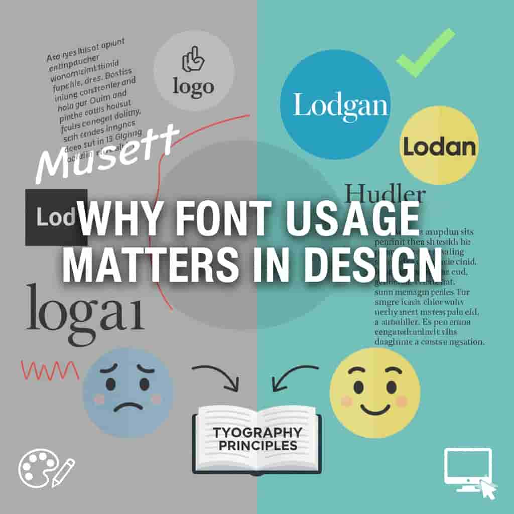
2. Why Font Usage Matters in Design
Fonts are more than just letters—they communicate personality, tone, and professionalism. For example, a handwritten font can evoke warmth and creativity, while a bold sans-serif font delivers strength and modernity.
According to Smashing Magazine, typography accounts for up to 95% of web design, making font usage one of the most critical design decisions.
3. Best Practices Font Usage You Should Always Follow
3.1 Keep Readability a Priority
No matter how stylish a font looks, readability should always come first. Your audience must be able to read your text easily without straining. For long paragraphs, stick with clean serif or sans-serif fonts.
👉 Try fonts like Nordin Elegant Serif for classy readability in branding projects.
3.2 Limit the Number of Fonts
Using too many fonts in a single design can look messy. Stick to two or three fonts maximum —one for headings, one for body text, and optionally one accent font.
👉 Pair a bold display font like Braga Urban Font with a simple sans-serif for balance.
3.3 Match Font Style with Brand Personality
Fonts should reflect the tone of your brand. For example:
- Playful fonts work for children’s brands.
- Minimalist fonts suit modern, tech-oriented companies.
- Elegant scripts are perfect for wedding invitations or luxury branding.
👉 Check out Girly Things Script for feminine and stylish designs.
3.4 Use Proper Font Pairing
A successful design often requires combining fonts that complement each other. Pairing a decorative script with a clean sans-serif creates balance.
👉 Example: Combine Romantic Handwritten Font with a clean geometric sans-serif for branding.
For more guidance, Canva’s font pairing guide provides excellent tips.
3.5 Pay Attention to Font Sizes and Hierarchy
Font size creates hierarchy, guiding readers through your content. Headings should be larger and bolder, while body text remains moderate for easy reading. Consistency in hierarchy ensures clarity and professionalism.
3.6 Optimize for Different Devices
With so much content consumed on mobile, fonts must scale well across devices. Always preview your design on multiple screen sizes to make sure it looks polished everywhere.
3.7 Consider Accessibility and Legibility
Design should be inclusive. Fonts with too thin strokes or extreme contrast can be difficult to read for people with vision impairments. Use accessible font choices and maintain proper contrast with the background.
👉 A clean, legitimate option is Mogan Sans Serif.
3.8 Test Fonts Before Finalizing
Never rely on first impressions alone. Test your chosen fonts in various settings—print, digital, and across devices. This ensures consistency and reliability in real-world applications.
4. Common Mistakes in Font Usage
- Using too many decorative fonts.
- Ignoring spacing and kerning.
- Choosing fonts inconsistent with brand identity.
- Poor contrast between font and background.
- Over-relying on trendy fonts instead of timeless ones.
5. Recommended Fonts for Professional Branding
At RaisProject, we design fonts to suit a variety of industries and needs. Here are a few top picks:
- Balmond Handpainted Font– perfect for artistic and creative brands.
- Riviera Elegant Serif– ideal for luxury and editorial design.
- Urban X Bold Sans– great for streetwear and modern branding.
- Playkids Fun Font– designed specifically for kids’ packaging and playful logos.
These fonts are crafted to enhance readability while showcasing personality—making them excellent examples of best practices font usage .

6. Conclusion
Fonts are not just decorative elements; they shape how audiences perceive and interact with your brand. By following best practices font usage —prioritizing readability, limiting font choices, matching styles with brand personality, and considering accessibility—you can create powerful, professional, and memorable designs.
Choosing the right font is an investment in your brand’s identity. Explore our full font collection at RaisProject to find the perfect fit for your next project.