
Table of Contents
- Introduction
- Why Choosing the Right Font Matters
- Understanding Font Classifications
- How to Match Fonts with Design Purposes
- The Psychology of Typography
- Common Mistakes When Choosing Fonts
- Recommended Fonts from RaisProject
- Final Thoughts
- References
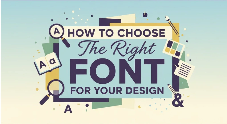
1. Introduction
Fonts are more than just letters—they’re visual voices that shape how people perceive your message. Whether you’re creating a logo, a website, or packaging, the right font can elevate your design and strengthen your brand identity.
In this guide, we’ll explore how to choose the right font for your design and share some beautiful font examples from RaisProject to inspire your next creative project.
2. Why Choosing the Right Font Matters
Typography influences how your audience feels about your brand before they even read your words. A luxury perfume brand using a playful handwritten font would feel inconsistent, while a minimalist tech brand wouldn’t fit a decorative serif.
The right font helps you:
- Communicate tone and personality clearly.
- Create visual harmony and brand consistency.
- Capture attention and make your design memorable.
As noted by Adobe Fonts Blog, typography is both an art and a science — combining emotional storytelling with technical precision.
3. Understanding Font Classifications
Each font style has its own personality and best use case. Understanding them will help you make more intentional design choices.
Serif Fonts
Serifs are classic and timeless. They add elegance and trust to your design—perfect for editorials, fashion, or luxury branding.
💡 Try Rodger Arnoud Font, a modern serif with sophisticated curves that fits premium brands beautifully.
Sans Serif Fonts
Sans serif fonts look modern, clean, and highly readable. They’re excellent for digital designs, technology brands, and startups.
💡 Try Break Sucker Display Font, a bold and unique sans serif with character—perfect for eye-catching headlines.
Script Fonts
Display Fonts
Display fonts are decorative and made for attention. Use them for titles, posters, or logos—but sparingly.
💡 Dariena Floralie Font is a stunning floral-themed display font that brings creativity and luxury to any design.
For more insight, see Creative Bloq’s typography guide, which explains how font classification impacts visual tone.
4. How to Match Fonts with Design Purposes
Different design projects call for different font styles. Here’s how to make the right match:
a. Branding and Logos
Your logo font should reflect your brand’s core identity. Serif fonts communicate professionalism, sans serifs convey innovation, and scripts add personality.
Adobe Design suggests pairing fonts that balance contrast and harmony for a timeless brand feel.
b. Print Design
For printed media, readability is key. Serifs work beautifully for books or brochures because they guide the eye naturally through text.
c. Web Design
Screen readability matters most online. Sans serif fonts are the safest for websites and mobile interfaces, while display fonts can make headers stand out.
See Adobe Design’s article on responsive typography for deeper insights.
d. Social Media & Advertising
For social posts and campaigns, go bold. Use strong display fonts like Break Sucker Display Font for main messages and pair them with subtle sans serifs for balance.
5. The Psychology of Typography
Fonts subconsciously influence how people feel about your design. Here’s what each major type communicates:
| Font Type | Conveys | Best Used For |
|---|---|---|
| Serif | Tradition, trust, class | Editorial, luxury, heritage brands |
| Sans Serif | Modernity, clarity | Startups, web design, tech |
| Script | Elegance, personality | Beauty, lifestyle, invitations |
| Display | Creativity, uniqueness | Ads, posters, packaging |
According to Adobe’s research on font psychology, typography directly affects emotional perception — making your choice crucial for brand messaging.
6. Common Mistakes When Choosing Fonts
Even skilled designers can slip up. Avoid these pitfalls:
- ❌ Using too many fonts in one design (stick to 2–3 max).
- ❌ Ignoring readability for style.
- ❌ Poor contrast between font and background.
- ❌ Overusing decorative fonts.
- ❌ Skipping device or print tests before publishing.
7. Recommended Fonts from RaisProject
Here are a few standout fonts from RaisProject that fit diverse design purposes:
- 🖋️ Rodger Arnoud Font — A refined serif for branding and editorial use.
- 💫 I Am Beautiful Font — Graceful script font ideal for luxury logos and personal branding.
- ⚡ Break Sucker Display Font — Bold, modern, and perfect for eye-catching posters or social media graphics.
- 🌸 Dariena Floralie Font — A creative floral display font that adds uniqueness to invitations and product packaging.
Explore more handcrafted fonts and exclusive bundles at RaisProject.com.
8. Final Thoughts
Choosing the right font is a mix of art, psychology, and strategy. The right typography doesn’t just decorate your design—it defines its personality and message.
Before you finalize your next project, think about how you want your audience to feel. Then, explore premium handcrafted fonts from RaisProject that can turn your creative vision into something unforgettable.