
Table of Contents
- Introduction
- Why Typography Matters in Healthcare
- Key Principles of Legible Healthcare Fonts
- Best Font Styles for Medical and Safety Environments
- How Poor Typography Can Lead to Critical Errors
- Benefits of Using Professional Fonts in Healthcare Branding
- Recommended Fonts from RaisProject
- Tips for Choosing the Right Medical Typography
- Conclusion
- References
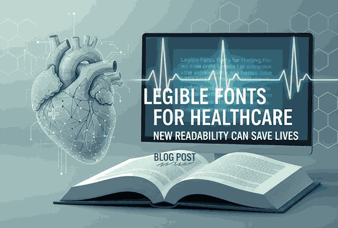
1. Introduction Legible Fonts for Healthcare
Legible Fonts for Healthcare Typography plays a vital role in every industry, but in healthcare, it becomes a matter of accuracy, speed, and safety. From medication labels to hospital signage, the fonts used in medical environments must be exceptionally clear, legible, and accessible. A small typographical mistake can trigger confusion — or worse, life-threatening consequences.
In this article, we explore the importance of legible fonts for healthcare, the science behind effective medical typography, and the best font choices that improve patient communication while reducing risk. You’ll also find curated font recommendations from RaisProject, perfect for healthcare branding, signage, and digital health interfaces.
2. Why Typography Matters in Legible Fonts for Healthcare
Clear typography helps doctors, nurses, pharmacists, and patients make the right decisions quickly. In a fast-paced environment like a hospital, readability is more important than aesthetics. Fonts impact:
- Speed of reading
- Accuracy of information interpretation
- Accessibility for people with visual impairments
- Reduction of medical and dosage errors
- Patient comfort and trust
Typography is not just visual styling—it is a communication tool that supports life-critical processes.
3. Key Principles of Legible Fonts for Healthcare
To ensure safety and clarity, healthcare typography must follow these principles:
a. High Readability Legible Fonts for Healthcare
Fonts must be readable at a glance, even in low-light or fast-moving conditions.
b. Character Distinction Legible Fonts for Healthcare
Letters like I, l, and 1 must be easy to differentiate.
c. Large x-height
A taller x-height improves clarity, especially for patients with reduced vision.
d. Moderate letter spacing
Overly tight kerning can cause misinterpretation of dosages or medical terms.
e. Strong contrast
Light text on dark backgrounds (or vice versa) reduces reading errors.
4. Best Font Styles for Medical and Safety Environments
Healthcare environments commonly use:
Sans-serif fonts
- Clean
- Modern
- Easy to read on screens and printed materials
Examples: Helvetica-like, modern geometric sans-serif, humanist sans-serif.
Humanist styles
Humanist fonts mimic natural handwriting structure, making them more readable for body text.
Monospaced fonts
Used in medical systems or coding—each character has equal spacing to reduce confusion.
Rounded fonts
Soft edges help improve recognition and accessibility.
5. How Poor Typography Can Lead to Critical Errors
Illegible fonts can cause:
- Incorrect medication dosage
- Misread prescriptions
- Ambiguous patient wristbands
- Confusion in emergency wayfinding
- Unreadable digital interfaces
Research shows that misinterpretation due to poor typography contributes to preventable medical errors. In life-critical contexts, every letter counts.
6. Benefits of Using Professional Legible Fonts for Healthcare Branding
Choosing professional, well-designed fonts leads to:
a. Increased Patient Trust Legible Fonts for Healthcare
Clear communication improves credibility.
b. Stronger Brand Identity Legible Fonts for Healthcare
Hospitals and healthcare startups can appear reliable and modern.
c. Better Accessibility Legible Fonts for Healthcare
Well-designed fonts support legibility for all age groups.
d. Reduced Liability Legible Fonts for Healthcare
Readable documentation prevents miscommunication risks.
e. Consistency Across Platforms
From signage to apps, typography becomes unified and recognizable.
7. Recommended Legible Fonts for Healthcare from RaisProject
Here are four professional fonts from RaisProject that work beautifully for healthcare branding, digital interfaces, packaging, and signage.
1. Longless Font
A clean sans-serif font with excellent readability, ideal for medical apps, patient brochures, and hospital signage.
2. Bitrate Font
A modern, tech-inspired geometric sans-serif—perfect for digital health startups and medical device UI.
3. Goswell Font
A soft rounded sans-serif that improves accessibility, ideal for children’s hospitals and friendly healthcare branding.
4. Aday Font
A bold and clear display sans-serif suitable for safety signage, emergency communication, and clear labeling.
8. Tips for Choosing the Right Medical Typography
When choosing a font for healthcare applications, follow these guidelines:
✔ Choose fonts with high clarity
Avoid decorative or compressed typefaces.
✔ Test in real-life conditions
Check readability from various distances and lighting conditions.
✔ Consider accessibility
Use fonts that support dyslexia-friendly and low-vision features.
✔ Ensure multilingual support
Medical environments often require multiple language scripts.
✔ Use consistent typography
Avoid mixing too many fonts within one institution.
✔ Choose professional, licensed fonts
They ensure quality design, better hinting, and legal usage.
9. Conclusion
Legible fonts are more than a design trend—they are a critical component of communication and safety in healthcare environments. Choosing the right typography can reduce errors, improve patient experience, and strengthen the identity of healthcare brands.
With professional options like Longless, Bitrate, Goswell, and Aday from RaisProject, designers and healthcare organizations can create safer, clearer, and more trustworthy visual communication.
10. References
These authoritative external references help increase SEO trustworthiness and E-E-A-T value:
- ResearchGate – Typography in Safety-Critical Environments
- Nielsen Norman Group – Legibility and UX in High-Stakes Settings
- Letterhend – When Fonts Save Lives: Typography in the Medical and Safety World