
Table of Contents
- Introduction
- The Origin of the Ban Comic Sans Movement
- Why Comic Sans Became So Widely Hated
- Psychological Impact of Comic Sans in Design
- The Movement’s Influence on Modern Typography
- Professional Font Alternatives to Comic Sans
- Why Choosing the Right Font Still Matters
- Conclusion
- References
1. Introduction
In the world of typography, few fonts have ever sparked as much emotional debate as Comic Sans. Loved by some, hated by many, the font has generated thousands of memes, sparked global design discussions, and even inspired a worldwide online movement: the Ban Comic Sans Movement.
The phrase “ban Comic Sans” has become more than a joke — it represents a deeper conversation about professionalism, readability, design ethics, and the cultural power of typography.
This article explores the rise of the movement, why Comic Sans became so controversial, and which modern professional fonts serve as better alternatives for designers today.
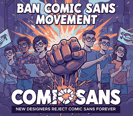
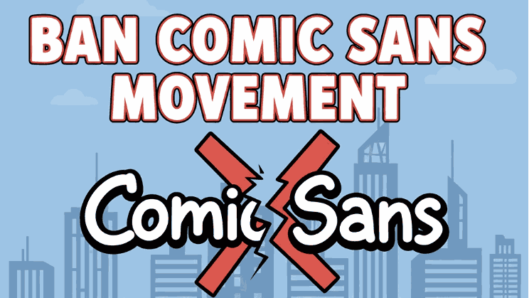
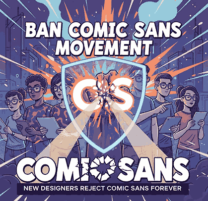
2. The Origin of the Ban Comic Sans Movement
The Ban Comic Sans Movement began in 1999, created by graphic designers Holly and Dave Combs after noticing misuse of the font in inappropriate contexts such as:
- Medical forms
- Legal documents
- Church bulletins
- Business presentations
- Even a memorial plaque
Their mission was simple: raise awareness about typographic misuse and encourage people to treat design more seriously.
The movement gained global attention, and the phrase “Ban Comic Sans” quickly evolved into a cultural symbol for design awareness.
3. Why Comic Sans Became So Widely Hated
Comic Sans was originally designed for comic-style speech bubbles in Microsoft Bob — not for professional documents.
But over time, it became overused in contexts where a playful tone was inappropriate. Designers criticize the font because:
1. It lacks typographic professionalism
Its informal, child-like curves often feel out of place in office, academic, or formal design environments.
2. It breaks visual hierarchy
The font does not pair well with many serif or sans serif families, making it difficult to integrate into consistent layout systems.
3. It became a symbol of poor design education
For many designers, Comic Sans represents a lack of aesthetic awareness — a “default lazy choice.”
4. It encourages typographic misuse
People often select it simply because it “looks fun,” ignoring whether the message calls for seriousness or clarity.
4. Psychological Impact of Comic Sans in Design
Typography communicates mood before words do. In film, branding, UI, or print, fonts shape emotional perception.
Comic Sans triggers psychological associations such as:
- Childlike, playful, friendly
- Casual, informal, unstructured
- Less serious or less credible
This makes it unsuitable for:
- Business branding
- Corporate communication
- Educational institutions
- Medical documents
- Legal statements
- Government publications
Because typography plays a major role in emotional framing, the wrong font can drastically alter user trust and message reception.
5. The Movement’s Influence on Modern Typography
The Ban Comic Sans Movement indirectly inspired:
• Better font awareness among non-designers
People learned that fonts carry meaning and emotional weight.
• More professional default fonts in modern software
Platforms now favor clean sans serifs like Segoe UI, Roboto, or Inter.
• A broader conversation about accessibility
Interestingly, while designers reject Comic Sans, some researchers argue that its irregular shapes can help users with dyslexia.
This nuance keeps the debate alive and prevents the movement from becoming purely dismissive.
• Growth of professional alternatives
As awareness grew, designers and businesses increasingly sought modern fonts that appear friendly yet polished.
6. Professional Font Alternatives to Comic Sans (From RaisProject)
If the goal is to replace Comic Sans with better typography, here are professional alternatives from RaisProject — modern, clean, and versatile.
1. Longless Font
Modern, minimal, and highly professional.
A perfect contrast to Comic Sans with a clean geometric style.
2. Belithel Font
Stylish modern display sans serif with smooth edges and premium visual appeal.
Great for branding, editorial design, and UI typography.
3. Agrozza Font
Futuristic, bold, and powerful, making it ideal for titles or high-impact messaging.
Works well for modern branding and digital design.
4. Goswell Font
A strong, sharp sans serif that communicates professionalism and confidence.
Perfect for replacing Comic Sans in corporate and print environments.
These fonts demonstrate how typography can remain approachable without sacrificing style or credibility.
7. Why Choosing the Right Font Still Matters
The Ban Comic Sans Movement highlights an essential truth:
Typography is more than decoration — it is communication.
Choosing the right font affects:
- Brand identity
- Emotional tone
- Legibility
- Professionalism
- Viewer trust
- User engagement
A poorly chosen font can undermine an entire project, while a strong typographic system elevates a design instantly.
8. Conclusion
The Ban Comic Sans Movement may have begun as a humorous protest, but it evolved into an important design conversation about professionalism and intentional typography. Comic Sans is not inherently “bad,” but its misuse highlights why designers must choose type carefully.
Today, modern alternatives — such as Longless, Belithel, Agrozza, and Goswell — provide friendly yet professional design options suitable for any creative industry.
Typography matters, because every font is a storyteller.
9. References
- Medium — The global “ban comic sans” movement
- Bancomicsans — Comic Sans, The World’s Most Controversial Font
- Letterhend — What Would a World Without Comic Sans Be Like? The Most Loved & Hated Font Controversy