
Table of Contents
- Introduction
- What Is Indonesian Vernacular Typography?
- Historical Roots of Indonesia’s Local Typographic Identity
- Why Vernacular Typography Matters Today
- Key Characteristics of Indonesian Vernacular Typography
- How Vernacular Elements Influence Modern Digital Fonts
- Examples of Fonts for Vernacular-Style Projects
- Practical Tips for Designers Using Vernacular Typography
- Conclusion
- References
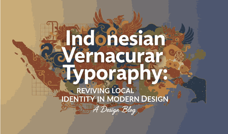
1. Introduction Indonesian Vernacular Typography
Indonesian Vernacular Typography design culture is rich, diverse, and deeply rooted in centuries of tradition. As the digital era transforms visual communication, designers are rediscovering the power of vernacular typography—type inspired by local culture, signage, ornaments, scripts, and everyday visual elements found across Indonesia. This trend is not only visually unique but also plays a vital role in preserving cultural identity.
For modern designers, creators, and brands, understanding Indonesian Vernacular Typography offers a unique opportunity to communicate authenticity while standing out in global digital landscapes. This article explores its cultural roots, design influence, and contemporary applications, and provides practical examples using downloadable fonts from RaisProject.com.
2. What Is Indonesian Vernacular Typography?
Vernacular typography refers to type and lettering styles that originate from local, cultural, or informal environments. In Indonesia, this includes inspirations such as:
- Traditional scripts (Aksara Jawa, Sunda, Batak, Bali, Bugis)
- Street signage typography
- Hand-painted market lettering
- Transportation typography (angkot, becak, trucks)
- Cultural ornament patterns
- Folk-art lettering seen on banners, stalls, or village events
Indonesian vernacular typography is therefore the visual language of daily life—a design form that expresses authenticity, locality, and cultural storytelling.
3. Historical Roots of Indonesia’s Local Typographic Identity
Indonesia’s typographic landscape evolved through various cultural influences:
A. Pre-Colonial Era Indonesian Vernacular Typography
Before Latin letters were widely used, many regions had their own writing systems such as:
- Aksara Jawa
- Aksara Bali
- Aksara Bugis / Lontara
- Aksara Sunda Kuna
- Aksara Batak
These scripts shaped visual composition, stroke patterns, and ornamentation still reflected in modern typography.
B. Colonial Influence Indonesian Vernacular Typography
Dutch signage, vintage serif styles, and old printing techniques introduced structured typographic forms that blended with local practices.
C. Street Culture Evolution Indonesian Vernacular Typography
As cities grew, Indonesia developed a unique street-typography identity—painted signs, angkot typography, truck slogans, local market banners—each forming a raw but vibrant visual style now admired by designers worldwide.
4. Why Indonesian Vernacular Typography Matters Today
1. Cultural Preservation
Vernacular typography captures visual heritage that might be replaced by globalized design trends. Bringing these elements into digital typography keeps cultural identity alive.
2. Branding Authenticity
Brands that use local typographic elements feel more relatable and trustworthy to Indonesian consumers.
3. Visual Differentiation
Global fonts often look similar; vernacular-inspired design stands out instantly.
4. Emotional Connection
Because vernacular typography reflects real-life environments, it creates stronger emotional bonds and nostalgia.
5. Key Characteristics of Indonesian Vernacular Typography
While vernacular styles vary by region, many Indonesian examples share common traits:
- Bold and expressive strokes
- Hand-drawn imperfections
- Bright and friendly lettering styles
- Decorative swashes or ornaments
- Simple but impactful shapes
- Cultural motifs like floral, geometric, or batik patterns
These characteristics can be blended with modern readability standards to produce digital fonts suitable for branding, posters, logos, and packaging.
6. How Indonesian Vernacular Typography Elements Influence Modern Digital Fonts
Modern digital type designers often merge traditional elements with contemporary typographic structures, resulting in fonts that are:
- Functional but culturally evocative
- Handcrafted in appearance
- Optimized for both print and digital platforms
- Suitable for branding, festivals, local businesses, or cultural campaigns
Designers can use such fonts to create identities that feel deeply rooted in Indonesian spirit while remaining globally competitive.
7. Examples of Fonts for Vernacular-Style Projects
Although RaisProject focuses on high-quality commercial fonts rather than purely traditional scripts, several typefaces from the collection work excellently for vernacular-inspired themes due to their handcrafted, expressive, or organic form.
A. Zarla Font (Display Serif)
Zarla combines strong display serif aesthetics with elegant curves, making it ideal for cultural branding, boutique packaging, or logos that need a touch of traditional elegance mixed with modern personality.
B. Harmonize Font (Handwritten Script)
A natural handwriting style that resembles real brush strokes—perfect for vernacular-inspired signage, food brands, local cafés, craft shops, or community-themed designs.
C. Natural Forest Font (Decorative Display)
A playful font with organic shapes that evoke Indonesia’s natural richness. Excellent for eco-products, cultural events, kids’ branding, festival graphics, and artisan packaging.
D. Brookfield Calligraphy (Elegant Calligraphy)
A refined calligraphy style that fits premium local brands, traditional ceremonies, heritage products, and cultural storytelling through typography.
8. Practical Tips for Designers Using Vernacular Typography
1. Understand the Cultural Context
Know the origin of the style you’re referencing—street, traditional, script, or regional identity.
2. Balance Style & Readability
Vernacular elements should enhance design, not distract from the message.
3. Pair Fonts Carefully
Use expressive fonts for headings and simpler fonts for body text.
4. Use Real-World Inspirations
Photograph street signage, market banners, vintage posters, or traditional ornaments.
5. Maintain Respect & Authenticity
Avoid using cultural scripts in inappropriate contexts; design with intention and respect.
9. Conclusion Indonesian Vernacular Typography
Indonesian Vernacular Typography is more than a design aesthetic—it is a celebration of culture, daily life, and identity. In an era of global standardization, vernacular-inspired type allows brands and designers to reconnect with authenticity and local storytelling.
By using expressive fonts—such as Zarla, Harmonize, Natural Forest, and Brookfield Calligraphy—designers can create meaningful, culturally relevant visuals that stand out in the modern digital world.
10. References
- Letterhend — Local Typography: Exploring Nusantara Fonts in the Digital Era
- Typographica Journal – Vernacular Typography in Southeast Asia
- Institut Teknologi Bandung (ITB) – Faculty of Art & Design Typography Research