
Table of Contents
- Introduction: Why Dark Mode Changes Font Readability
- How Human Vision Works in Dark Mode
- Key Principles of Readable Fonts in Dark Interfaces
- Best Font Characteristics for Dark Mode
- Recommended RaisProject Fonts for Dark Mode UI
- Common Mistakes Designers Make in Dark Mode Typography
- How to Test Font Readability in Dark Mode
- Final Thoughts
- References
1. Introduction: Why Changes Dark Mode Font Readability
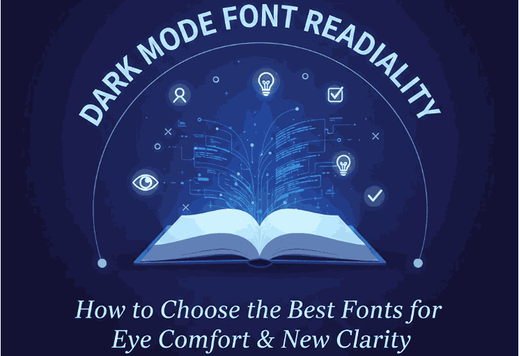
Dark Mode Font Readability has become a dominant visual trend across websites, apps, and digital interfaces. Users prefer it not just for its sleek aesthetic, but also for reduced eye strain, longer battery life, and improved nighttime readability.
However, switching a UI to dark mode isn’t as simple as inverting colors. Typography behaves differently on a dark background. Fonts that look clean in light mode may become blurry, thin, or hard to read in dark mode. That’s why Dark Mode Font Readability is now a critical design consideration for UI/UX designers, web developers, and brand creators.
In this article, we’ll explore how typography interacts with dark mode, what font characteristics improve readability, and which RaisProject fonts are perfect for high-contrast, eye-friendly dark interfaces.

2. How Human Vision Works in Dark Mode Font Readability
The human eye perceives contrast differently in low-light conditions. When viewing light text on a dark background:
- The iris opens wider to allow more light in.
- The glowing light text can cause halation (a halo effect).
- Fine, thin lines appear weaker and lose clarity.
- The retina becomes more sensitive to sharp brightness contrast.
This means fonts must be:
- Slightly thicker
- Clear and balanced in shape
- High legibility even at small sizes
Otherwise, the reading experience becomes uncomfortable or visually fatiguing.
3. Key Principles in Dark Mode Font Readability Interfaces
Here are essential typography rules for dark mode:
✔ Increase font weight
Ultra-thin or hairline fonts disappear on dark backgrounds.
✔ Enhance letter spacing
A bit of tracking prevents letterforms from blending together.
✔ Use high contrast—but not pure white
Pure #FFFFFF text on pure black (#000000) can cause eye strain.
Soft whites (#EDEDED) and dark grays (#111111) work better.
✔ Avoid overly decorative fonts for body text
Clean sans-serif fonts retain clarity better in low-light environments.
4. Best Characteristics for Dark Mode Font Readability
Look for fonts with:
- Open apertures (larger openings in letters like “e”, “a”, “s”)
- Medium weight (400–600)
- Strong proportions
- Balanced stroke contrast
- Clear geometric or humanist structure
These characteristics help maintain readability at different sizes and screen types.
5. Recommended RaisProject for Dark Mode Font Readability UI
Here are curated RaisProject fonts that work beautifully in dark mode, each with strong readability and modern style.
1. Ryalie Aurea Font
This elegant sans serif is crafted with a clean geometric structure, perfect for enhancing clarity in low-light designs.
Why it works well in dark mode:
- Excellent open shapes
- Balanced weights
- Smooth curves that reduce visual noise
Ideal for: app UI, website headers, branding in dark themes.
2. Longless Font
A futuristic sans serif with strong readability, even on OLED screens.
Dark mode advantages:
- Sharp edges but not overly thin
- Modern minimalist style
- Works exceptionally well for headings
Perfect for dashboard interfaces, tech products, or minimalistic websites.
3. Goswell Font
A modern sans serif with bold character and excellent clarity.
Strengths for dark mode:
- Medium-thick strokes
- Strong contrast handling
- Great at smaller sizes
Works best in UI elements, navigation menus, and compact layouts.
4. Aday Font
A decorative yet clean sans serif with multiple styles.
Dark mode benefits:
- Flexible weights
- Works well for headings and subheadings
- Not overly complex, still readable
Good for creative websites, branding, and hero text in dark layouts.
6. Common Mistakes Designers Make in Dark Mode Font Readability Typography
Avoid these dark mode pitfalls:
❌ Using ultra-thin fonts
They look elegant in light mode but vanish in dark mode.
❌ Text too bright
Pure white text creates glare and discomfort.
❌ Too much color saturation
Neon colors glow excessively on black backgrounds.
❌ Poor line spacing
Tight leading causes text blocks to merge visually in dark environments.
7. How to Test in Dark Mode Font Readability
Before finalizing your typography:
✔ Test on multiple screens
OLED, IPS, TN, mobile, and desktop behave differently.
✔ Test when brightness is low
Simulate real user conditions.
✔ Place text over gradients, images, and pure black
Make sure the font stays readable.
✔ Use accessibility contrast guidelines
WCAG suggests at least 4.5:1 contrast ratio.
8. Final Thoughts Dark Mode Font Readability
As dark mode becomes the norm, designers must understand how typography adapts to low-light environments. Choosing the right font can transform readability, aesthetics, and user comfort.
RaisProject provides a wide selection of fonts designed with clarity, style, and versatility in mind. By using dark-mode-friendly fonts like Ryalie Aurea, Longless, Goswell, and Aday, you can ensure your designs look professional, comfortable, and visually stunning in any environment.
9. References
- Nielsen Norman Group — Dark Mode vs Light Mode
- WCAG — Web Content Accessibility Guidelines
- Letterhend — Dark Mode Fonts & Eye Comfort