

Table of Contents
- Introduction
- What Is Font Perception in Design?
- Why Typography Shapes Emotions and Decisions
- Key Principles Behind Font Perception
- 4.1 Serif Fonts
- 4.2 Sans Serif Fonts
- 4.3 Script & Calligraphy Fonts
- 4.4 Display & Decorative Fonts
- How to Choose Fonts Based on Perception
- Real-World Examples of Font Perception
- Best RaisProject Fonts for Effective Design Perception
- Conclusion
- References
1. Introduction Font Perception in Design
Font Perception in Design Typography is more than a visual element — it’s a powerful psychological tool. Whether people realize it or not, fonts shape how they feel about a brand, a product, or a message. The way letters look communicates personality, tone, and trustworthiness before a single word is even read.
This is why Font Perception in Design has become a major focus in branding, UI/UX, marketing, packaging, and digital communication. Businesses that understand font psychology gain a competitive advantage: they can persuade, build trust, and create memorable experiences with intentional typography.
In this article, we’ll dive deep into how fonts influence perception and how you can strategically use typography in your design work.
2. What Is Font Perception in Design?
Font perception refers to how people interpret, judge, and emotionally respond to a typeface. Fonts influence the viewer’s thoughts about:
- professionalism
- elegance
- friendliness
- modernity
- luxury
- reliability
- creativity
Different fonts create different psychological associations. For example, a gentle script font communicates warmth, while a bold geometric sans serif communicates strength and modernity. Mastering font perception means choosing typography that aligns perfectly with your design purpose.
3. Why Typography Shapes Emotions and Decisions
Studies in cognitive psychology show that typography affects users’ emotions, comprehension, and decision-making. People often trust, ignore, or prefer certain designs solely based on typeface use.
Here’s why fonts matter psychologically:
- Humans interpret visual style before reading text.
- Brain processes shape-based signals instantly.
- Familiar typography increases trust.
- Elegant fonts can increase perceived product value.
- Serif and script fonts feel more personal and emotional.
- Sans serif fonts feel cleaner and more modern.
Typography acts as a “silent messenger,” guiding how users feel about a brand or product.
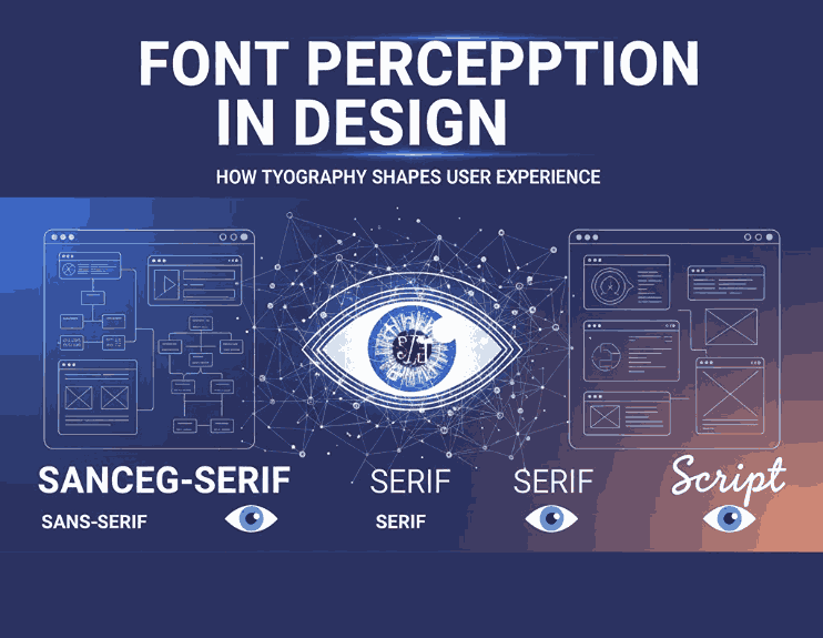
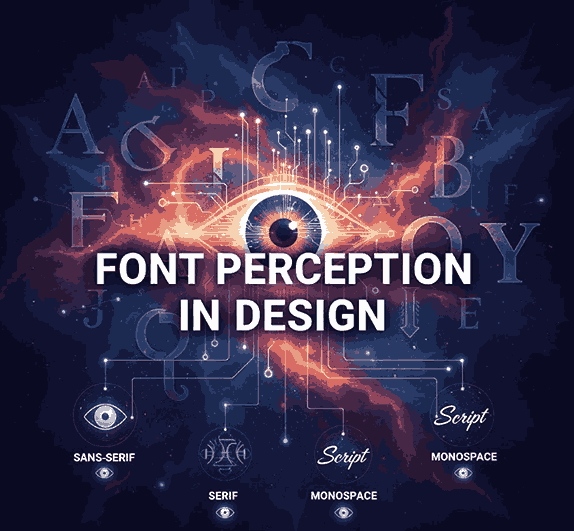
4. Key Principles Behind Font Perception in Design
Different font categories create different psychological effects. Here’s how major classifications shape perception:
4.1 Serif Fonts – Trustworthy & Traditional
Serif fonts have small decorative lines at the ends of letters. They are often associated with:
- tradition
- reliability
- sophistication
- authority
This makes them perfect for luxury brands, editorial design, and formal branding.
4.2 Sans Serif Fonts – Modern & Minimalist
Sans serif fonts remove decorative strokes, producing a clean and modern look. They convey:
- simplicity
- clarity
- professionalism
- efficiency
Perfect for digital interfaces, modern branding, technology products, and minimal aesthetics.
4.3 Script & Calligraphy Fonts – Elegant & Emotional
Script fonts resemble handwritten strokes, expressing:
- creativity
- romance
- personal touch
- elegance
Fantastic for invitations, boutique branding, product packaging, and artistic experiences.
4.4 Display & Decorative Fonts – Bold & Unique
These fonts are designed for visual impact. They create:
- strong personality
- distinctiveness
- emotional emphasis
- instant attention
Use them selectively for headlines, logos, and promotional materials.
5. How to Choose Fonts Based on Font Perception in Design
When selecting typography, always ask these questions:
1. What emotion do you want to evoke?
Luxury? Choose serif or elegant script.
Modern? Choose geometric sans serif.
Friendly? Choose rounded or soft fonts.
Energetic? Choose bold display fonts.
2. Who is the target audience?
Fonts for children differ drastically from fonts for corporate audiences.
3. What is the brand personality?
Typography must match the brand voice: premium, playful, futuristic, minimal, etc.
4. How will the design be used?
Digital, print, packaging, billboard, UI — each usage demands different font qualities.
Choosing fonts purposefully ensures visual harmony and psychological impact.
6. Real-World Examples of Font Perception in Design
Apple – Modern Simplicity
Uses clean sans serif typography to communicate innovation and minimalism.
Luxury Brands – Elegance Through Serif Fonts
Brands like Vogue, Tiffany, and Gucci use serif fonts to reflect premium quality.
Food & Lifestyle Brands – Natural Script Fonts
Handmade or organic products often use script typography to signal authenticity.
Technology Brands – Futuristic Display Fonts
Tech companies use bold geometric fonts to appear advanced and cutting-edge.
This proves typography is a core element of brand perception, not just decoration.
7. Best RaisProject for Effective Font Perception in Design
Below are recommended fonts from RaisProject that strongly support psychological design principles.
1. Space Power Font — Futuristic & Modern
Perfect for modern branding, technology products, futuristic promotions, or digital interfaces.
Perception delivered: innovation, clarity, boldness.
2. Zasfrina Kaley Font — Elegant Serif for Luxury
A sophisticated serif font ideal for luxury branding, high-end packaging, and editorial design.
Perception delivered: premium, refined, classic.
3. Brookfield Calligraphy Font — Romantic & Personal
A graceful handwritten script that works beautifully for lifestyle brands, packaging, invitations, and social media.
Perception delivered: warmth, emotion, artistic.
These three fonts are excellent examples to showcase how typography shapes viewer perception across different design categories.
8. Conclusion Font Perception in Design
Font perception is one of the most critical — yet often overlooked — aspects of design. Choosing the right typography enhances emotional connection, improves user experience, and strengthens brand identity. Whether you’re designing for luxury, minimalism, creativity, or technology, understanding font perception ensures your message is clear, powerful, and memorable.
RaisProject offers a wide range of expertly crafted typefaces designed with psychology and visual harmony in mind. By selecting the right font, you elevate your design from ordinary to extraordinary.
9. References Font Perception in Design
- TypeWolf — Guides & Resources
- 99Designs — The fundamentals of font psychology
- Canva — The definition of font psychology and how to use it
- Letterhend — Fonts That Move Emotions: How Letters Influence Your Decisions Without You Realizing It