
Table of Contents
- Introduction
- Understanding the Attention Economy
- Why Typography Matters in Attention-Driven Design
- The Psychology Behind Typeface Attraction
- How Fonts Influence User Behavior
- Readability & Visual Comfort
- Emotional Triggers
- Pattern Disruption
- Hierarchy & Click Behavior
- Examples of Typography in the Attention Economy
- Best RaisProject Fonts for High-Attention Branding
- Practical Tips for Using Typography to Capture Attention
- Conclusion
- References
1. Introduction Attention Economy Typography
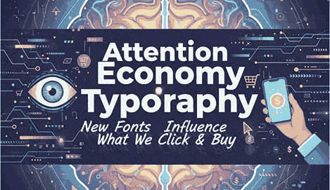
Attention Economy Typography In a world flooded with information, brands are no longer fighting for space — they’re fighting for attention. Every second, users scroll past hundreds of messages, ads, and visual content. This creates what we call the attention economy, where brands must strategically design their visuals to get noticed.
One of the most underestimated tools in grabbing attention is typography. Fonts can influence what people click, whether they continue reading, and even what they eventually purchase. This is why understanding Attention Economy Typography is crucial for designers, marketers, and business owners.
2. Understanding the Attention Economy Typography
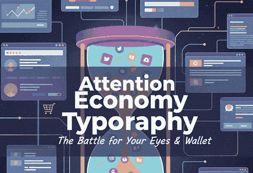
The attention economy describes the competition among brands to capture limited user attention in a digital environment overloaded by stimuli.
Modern consumers are exposed to:
- Social media ads
- Email newsletters
- Notifications
- Website banners
- Visual content everywhere
With such high competition, typography emerges as a powerful psychological trigger to make your message stand out.
3. Why Typography Matters in Attention Economy Typography-Driven Design
Typography shapes:
- First impressions
- Message clarity
- User engagement
- Emotional response
- Click likelihood
In marketing, even small changes in font weight, style, or spacing can dramatically impact user behavior. Studies show that typography affects processing fluency — how easily the brain interprets information — which directly influences motivation and decision-making.
Fonts can literally change how people feel about your brand.
4. The Psychology Behind Typeface Attraction
Typography taps into cognitive and emotional triggers including:
1. Familiarity Attention Economy Typography
Clean sans-serif fonts feel modern and comfortable on screens.
2. Emotion Attention Economy Typography
Script and calligraphy fonts evoke warmth, elegance, and personal connection.
3. Authority Attention Economy Typography
Bold or heavy fonts command attention and convey confidence.
4. Novelty Attention Economy Typography
Decorative fonts can disrupt scrolling behavior and make users stop.
Understanding these triggers helps brands intentionally shape user interactions.
5. How Fonts Influence User Behavior
A. Readability & Visual Comfort
Readable fonts reduce cognitive load. If the brain can process your text quickly, engagement increases.
B. Emotional Triggers
Fonts evoke emotions that influence purchasing decisions. This is critical in branding and advertising.
C. Pattern Disruption
A unique font style can interrupt mindless scrolling, forcing the eye to focus.
D. Hierarchy & Click Behavior
Bold headlines, contrasting typefaces, and strong display fonts guide users to the right action — such as clicking a button or reading more.
Typography is not decoration — it’s behavioral design.
6. Examples of Attention Economy Typography
Large companies use typography deliberately:
- Netflix uses bold, high-contrast fonts to enhance user attention.
- YouTube uses clean sans-serif fonts to maximize readability across devices.
- Airbnb crafts a friendly, inviting feel using rounded typography.
- Coca-Cola relies on emotional script typography for iconic brand recall.
In each case, typography is used to attract attention, build emotion, and guide behavior.
7. Best RaisProject Fonts for High-Attention Economy Typography Branding
Here are RaisProject’s top fonts that work exceptionally well for attention-driven marketing and branding.
1. Blandis Font — Bold & Commanding Attention
This font is powerful for headlines, posters, banners, and digital ads. Its bold structure cuts through noise and instantly grabs attention.
2. Goswell Font — Modern, Clean, Highly Readable
Perfect for websites, UI, branding, and marketing assets. Its simplicity increases processing fluency, making users more likely to continue reading.
3. Longless Font — Futuristic Sans-Serif for Digital Brands
Ideal for high-tech branding, editorial design, and promotional graphics that need a sharp, modern look. Its strong geometry enhances visibility.
4. The Ruler Font — Stylish Display Font with High Visual Impact
A unique display typeface designed to disrupt visual patterns. Perfect for titles, packaging, posters, and CTA graphics where attention is crucial.
8. Practical Tips for Using Typography to Capture Attention
✓ 1. Use Contrast to Create Visual Hierarchy
Combine a bold display font with a clean sans-serif for maximum clarity.
✓ 2. Choose Fonts That Match Your Brand Emotion
Energetic brands need bold fonts. Luxury brands need elegant ones.
✓ 3. Optimize for Mobile Readability
In the attention economy, most people view content on their phones.
✓ 4. Use Typography to Guide Eye Movement
Use bold fonts for headlines and lighter fonts for supporting text.
✓ 5. Avoid Over-decorated Fonts in Body Text
Decorative fonts should be used sparingly to avoid cognitive overload.
✓ 6. Use Pattern Disruption Strategically
Use display fonts in key areas like hero sections, banners, and CTAs.
Typography alone can increase click-through rate (CTR) when used with intention.
9. Conclusion Attention Economy Typography
In the attention economy, typography isn’t just a design choice — it’s a competitive advantage. Fonts have the power to stop scrolling, spark emotion, improve readability, and influence decisions. By choosing the right typefaces, brands can guide user behavior and communicate their identity more effectively.
RaisProject fonts are designed with these psychological principles in mind, ensuring that you can create impactful visuals that capture attention and drive engagement.
10. References
- Canva — The definition of font psychology and how to use it
- 99designs — The fundamentals of font psychology
- GoogleFonts — Fonts Knowledge
- SmashingMagazine — Typography