

Table of Contents
- Introduction
- What Is Digital Shading in Photoshop?
- Why Shading Is Essential in Digital Design
- Understanding Light, Shadow, and Depth
- Essential Photoshop Tools for Digital Shading
- Proven Digital Shading Tips Photoshop Designers Use
- Using Typography for Shading Practice
- Font Mockup Examples from Rais Project
- Common Digital Shading Mistakes to Avoid
- How Shading Improves Professional Design Quality
- Conclusion
- References
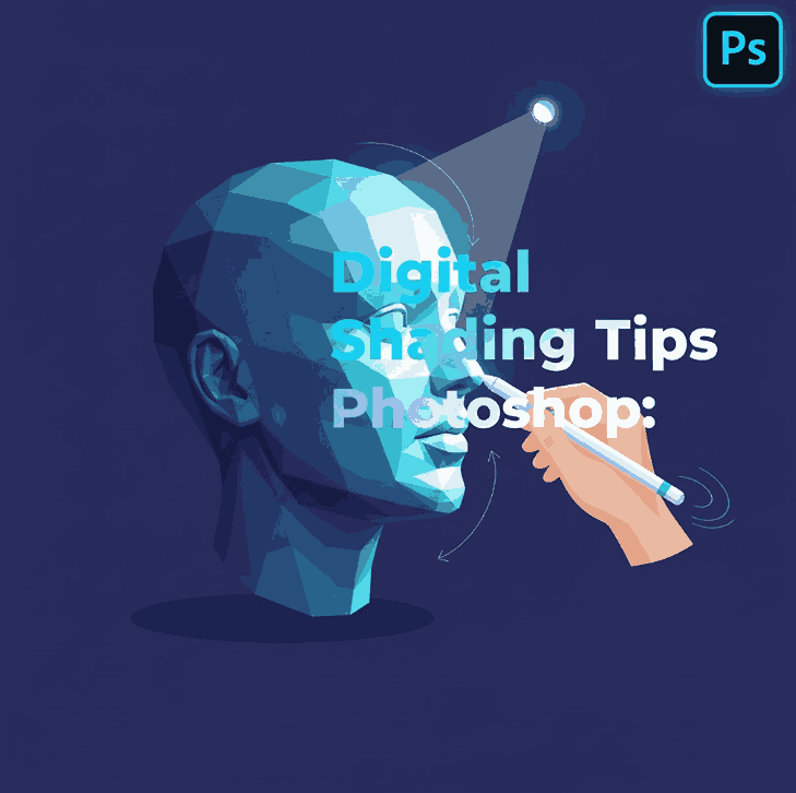
1. Introduction Digital Shading Tips Photoshop
Creating visually compelling designs is no longer just about color and composition. One of the most powerful techniques that transforms flat visuals into immersive, realistic artwork is digital shading. For designers and illustrators, mastering digital shading tips Photoshop users rely on is essential for building depth, realism, and emotional impact.
Whether you are working on typography, illustrations, posters, or branding assets, Photoshop offers powerful tools to help you control light, shadow, and texture. In this article, we explore practical digital shading techniques, professional tips, and how typography—especially expressive fonts—can be used as an excellent shading practice medium.

2. What Is Digital Shading Tips Photoshop?
Digital shading is the process of adding shadows, highlights, and tonal variations to create the illusion of depth and volume in digital artwork. In Photoshop, shading is applied using layers, brushes, blending modes, gradients, and masks.
Unlike traditional shading, digital shading allows:
- non-destructive editing
- easy light direction adjustment
- fast experimentation
- precise control over contrast and softness
This flexibility makes Photoshop the industry standard for shading in digital design.
3. Why Digital Shading Tips Photoshop Is Essential
Shading is what separates amateur designs from professional visuals. Without shading, designs often look flat and lifeless.
Proper shading:
- enhances realism
- improves visual hierarchy
- adds depth and dimension
- guides viewer focus
- strengthens emotional impact
In typography and branding, shading helps text feel grounded and integrated within the design environment.
4. Understanding Light, Shadow, and Depth
Before applying any digital shading tips in Photoshop, understanding light behavior is critical.
Key Concepts
- Light Source: determines where highlights and shadows appear
- Highlight: brightest area hit directly by light
- Midtone: transition between light and shadow
- Core Shadow: darkest area away from light
- Cast Shadow: shadow projected onto other surfaces
A consistent light source is essential to maintain realism.
5. Essential Tools for Digital Shading Tips Photoshop
Photoshop provides powerful tools for shading control:
- Brush Tool – for manual shading and soft gradients
- Gradient Tool – smooth tonal transitions
- Layer Masks – non-destructive shading control
- Blending Modes – Multiply, Overlay, Soft Light, and Normal
- Opacity & Flow Controls – precise shading intensity
- Gaussian Blur – soften shadow edges
Professional designers often combine multiple tools for realistic results.
6. Proven Digital Shading Tips Photoshop Designers Use
Here are practical and effective digital shading tips you can apply immediately:
Use Separate Shading Layers
Always shade on new layers. This keeps your workflow flexible and clean.
Start with Soft Shadows
Begin with low-opacity brushes and build shading gradually.
Use Multiply for Shadows
Multiply blending mode creates natural shadow depth without dulling colors.
Avoid Pure Black
Realistic shadows use dark blues, purples, or warm tones—not pure black.
Zoom Out Frequently
Check your shading at different zoom levels to maintain balance.
Control Edges
Hard edges for strong light, soft edges for diffused lighting.
7. Using Typography for Digital Shading Tips Photoshop Practice
Typography is an excellent medium for practicing digital shading in Photoshop. Letterforms offer clear structure, curves, and surfaces that react naturally to light.
Shading typography helps designers:
- understand form and volume
- practice shadow direction
- improve visual realism
- enhance logo and headline designs
Handwritten and calligraphy fonts work especially well for shading exercises.
8. Font Mockup Examples from Rais Project
Below are font examples from RaisProject that work perfectly for typography-based shading practice and Photoshop mockups:
- King Point Font – Elegant calligraphy font with flowing strokes, ideal for practicing highlight and shadow transitions
- Hand Signature Font – Natural handwritten style perfect for soft shading and realistic depth effects
- Caption Handwritten Font – Bold handwritten font suitable for dramatic shadows and contrast-heavy shading
- Brookfield Calligraphy Font – Artistic script font that shines when enhanced with layered shading and highlights
Using these fonts in Photoshop allows designers to explore realistic text depth, shadow placement, and dimensional effects.
9. Common Digital Shading Mistakes to Avoid
Even experienced designers make these common mistakes:
- inconsistent light direction
- overusing blur
- shading too dark too quickly
- ignoring midtones
- applying shadows uniformly
Awareness of these issues helps you refine your shading technique faster.
10. How Shading Improves Professional Design Quality
Mastering digital shading improves your work across many areas:
- logos appear more dimensional
- typography feels premium
- illustrations gain realism
- marketing visuals become more engaging
Clients and audiences subconsciously associate good shading with high-quality design.
11. Conclusion
Digital shading is one of the most valuable skills a designer can master. By applying proven digital shading tips Photoshop professionals use, you can transform flat visuals into rich, realistic designs.
Practicing shading with expressive fonts—like those from RaisProject—not only improves your technical skills but also enhances your creative confidence. With consistent practice, shading becomes an intuitive tool that elevates every design you create.
12. References
- Envato Tuts+ – Photoshop Shading Tutorials
- Clip Studio Tips – Understanding Light and Shadow
- Smashing Magazine – Digital Illustration and Shading
- Letterhend – Shading: The Key to Transforming a Flat Image into a Realistic One