
Table of Contents
- Introduction
- What Is Cinematic Font Design?
- Why Typography Matters in Film
- Key Characteristics of Cinematic Fonts
- Popular Styles Used in Movie Typography
- How Designers Choose Cinematic Fonts
- Real Examples of Cinematic Font Design
- Best RaisProject Fonts for Cinematic Design (Mockups Included)
- Tips to Create Strong Cinematic Typography
- Conclusion
- References
1. Introduction Cinematic Font Design
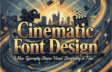
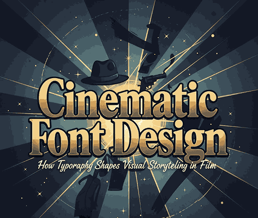
Cinematic Font Design Typography in the film industry plays a more powerful role than most viewers realize. From dramatic title cards to emotionally charged subtitles, the right typeface can transform a movie’s tone, mood, and storytelling impact. This is the essence of cinematic font design—a visual language made specifically to enhance narrative, emotion, and immersion.
In the world of graphic design and film, cinematic fonts help convey genre, personality, and emotion within just a few seconds. Whether it’s a bold serif for a historical drama or a minimal sans serif for a sci-fi thriller, cinematic fonts guide viewers before the story even begins.
2. What Is Cinematic Font Design?
Cinematic font design refers to the selection, styling, and creative use of typography in film-related media such as:
- movie titles
- opening credits
- subtitles
- posters
- film promotions
- streaming thumbnails
This design approach prioritizes emotional impact, readability, and genre alignment.
3. Why Typography Matters in Film Cinematic Font Design
Typography in film is more than decoration—it is storytelling.
Typography influences:
- Mood — determines whether the film feels dark, mysterious, romantic, or futuristic.
- Genre recognition — serif = drama; bold modern fonts = action; handwritten fonts = romance.
- Brand identity — iconic movies are often remembered by their title fonts.
- Emotional experience — the right font amplifies tension, excitement, or nostalgia.
A well-designed cinematic font can make a film instantly recognizable—much like the lettering of Star Wars, Harry Potter, or The Godfather.
4. Key Characteristics of Cinematic Font Design
Cinematic fonts typically include:
1. Strong Visual Identity Cinematic Font Design
They must be unforgettable and impactful with a glance.
2. High Readability Cinematic Font Design
Especially for subtitles, trailers, and posters.
3. Emotional Alignment Cinematic Font Design
Fonts must match the tone of the story.
4. Graphic Adaptability Cinematic Font Design
Cinematic fonts should work well in multiple environments: screens, posters, digital streaming thumbnails, and motion graphics.
5. Popular Styles Used in Movie Typography
Below are some styles often used in cinematic design:
• Elegant Serif Fonts
Used in romance, drama, and historical films.
• Modern Sans Serif Fonts
Clean, bold, and perfect for sci-fi, action, and futuristic movies.
• Script & Handwritten Fonts
Great for romance, indie films, and emotional storytelling.
• Display Fonts
Used to create strong brand identity—often unique and highly stylized.
6. How Designers Choose Cinematic Fonts
Selecting the perfect cinematic typeface usually depends on:
- Genre alignment
- Color grading of the film
- Target audience
- Marketing direction
- Title length
- Poster composition and layout
Designers also consider how well the font animates in motion graphics for opening sequences or trailers.

7. Real Examples of Cinematic Font Design
- Horror films often use distorted, sharp, or grungy fonts.
- Romantic films rely on delicate scripts or soft serif typography.
- Action films use powerful, bold fonts with strong geometric structure.
- Sci-fi films favor clean, futuristic sans-serifs.
These choices strengthen viewer expectations and build an emotional connection before the movie starts.
8. Best RaisProject Fonts for Cinematic Design (Mockup Examples Included)
To help designers visualize cinematic typography, here are some perfect RaisProject fonts that align well with film aesthetics:
1. Zasfrina Kaley Font
Elegant Serif for Drama, Romance & Art Films
Perfect for emotional storytelling, film posters, and classic cinema themes.
2. Andre Martin Font
Luxury Serif for High-End Cinematic Titles
Ideal for period dramas, documentary titles, and character-driven films.
3. Clora Font
Stylish Serif & Script Combination
Gives a refined, dramatic, and visually striking cinematic look—great for title logos and promotional materials.
These fonts can be used in mockups such as posters, film titles, or opening credit animations to enhance the article.
9. Tips to Create Strong Cinematic Typography
Here are techniques professional designers use:
1. Prioritize Dramatic Contrast
Use large titles, wide spacing, and high contrast to create cinematic impact.
2. Use Color Grading Techniques
Typography color should follow the movie’s tone—warm for romance, cold for sci-fi, dark for horror.
3. Pair Fonts Carefully
One for titles, one for subtitles or credits.
4. Add Subtle Motion
Even minimal animation makes typography feel alive and cinematic.
5. Keep Readability a Priority
Especially for promotional thumbnails and subtitles.
10. Conclusion
Cinematic font design is a vital part of film storytelling. It helps shape viewer emotions, set the tone, and create memorable visual identity. Whether you’re designing film posters, trailers, or promotional materials, choosing the right cinematic font enhances the overall narrative experience.
RaisProject’s typographic collection offers powerful and expressive typefaces ideal for cinematic design, helping designers produce Hollywood-level visuals.