
Table of Contents
- Introduction
- What Is Font Readability and Why It Matters
- How Fonts Influence Cognitive Processing
- The Role of Typography in Digital Reading
- Key Factors That Impact Readability
- How Designers Can Improve Cognitive Clarity
- Best Font Types for Maximum Readability
- Recommended Font Examples from RaisProject
- Conclusion
- References
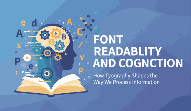
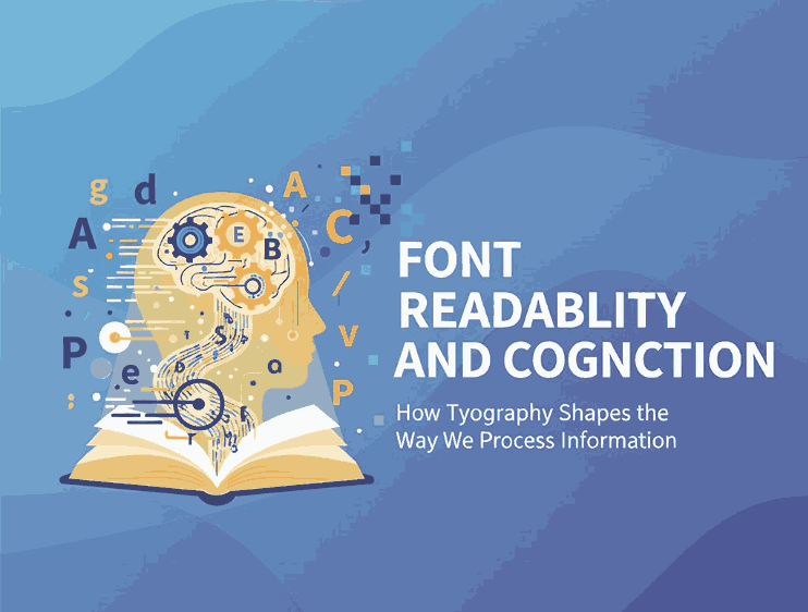
1. Introduction Font Readability and Cognition
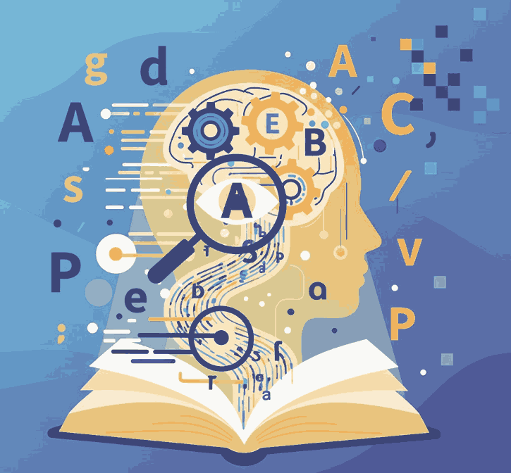
Font Readability and Cognition Typography plays a crucial role in how people understand, process, and remember information. In a world dominated by digital screens, where attention spans continue to shrink and content consumption grows exponentially, choosing the right font is no longer just a design preference — it is a cognitive strategy.
Font readability and cognition refer to how typefaces affect the brain’s ability to decode text, maintain attention, and form mental connections. When typography supports cognitive flow, readers are more likely to comprehend and retain the message. But when fonts are poorly chosen, the brain must exert extra effort, leading to fatigue, confusion, or disengagement.
This article explores the science behind readability, how typography interacts with neural processing, and how designers can use cognitive-friendly fonts to improve communication and user experience.
2. Why It Matters Font Readability and Cognition
Font readability is the ease with which readers can distinguish letters, scan text, and extract meaning. High readability reduces cognitive load, allowing the audience to focus on the message instead of struggling with the text itself.
Readable typography matters because:
- It increases comprehension
- It improves memory retention
- It reduces visual fatigue
- It enhances trust and professionalism
- It helps guide the reader through the content effortlessly
Research shows that legible fonts improve reading speed and content retention, especially in online environments where distractions are everywhere.
3. How Influence Font Readability and Cognition Processing
Studies in neuroscience and cognitive psychology reveal that fonts can significantly impact:
a. Attention Font Readability and Cognition
Clean, balanced, and evenly spaced fonts help the brain stay focused. Complex or decorative fonts drain attention faster.
b. Memory Font Readability and Cognition
Readable fonts improve information encoding — the process of storing information in memory.
c. Emotional Response
Even subtle font variations influence mood and perception. Serif fonts evoke professionalism, while sans-serif fonts evoke clarity and modernity.
d. Processing Fluency
If the brain can process text quickly, readers feel more confident and view the message as more credible.
These cognitive factors prove that typography is a decision that affects both the logical and emotional brain.
4. The Role of Typography in Digital Reading Font Readability and Cognition
Digital screens introduce new challenges for cognition:
- Blue light causes faster fatigue
- Low contrast reduces clarity
- Mobile screens force rapid scanning
- Fast scrolling affects comprehension
Because of this, modern digital design strongly favors:
- Sans-serif fonts
- Larger text sizes
- Ample line spacing
- Minimalist letterforms
Readable fonts enhance UX, reduce bounce rates, and improve conversion — making them essential for websites, apps, and long-form digital content.
5. Key Factors That Impact Font Readability and Cognition
Readability is shaped by several typographic characteristics:
Letter Shapes
Characters must be clearly distinguishable. Ambiguous letter shapes slow recognition.
Spacing (Tracking & Kerning)
Tight spacing stresses the eyes; balanced spacing helps smooth visual flow.
Line Height
Generous line spacing increases speed and reduces fatigue.
Contrast
Strong contrast enhances clarity, while low contrast strains the brain.
Font Weight
Too-thin or overly bold text reduces legibility; medium weights often perform best.
Serif vs Sans-Serif
Sans-serif tends to dominate digital reading, while serif fonts help guide the eye in print.
Designers must consider all these factors when choosing fonts for content-heavy platforms.
6. How Designers Can Improve Font Readability and Cognition Clarity
Here are best practices supported by research:
✔ Use clean, modern fonts
Sans-serif fonts support fast recognition and reduce cognitive load.
✔ Increase line spacing
1.4–1.6 line height significantly improves readability.
✔ Choose fonts with tall x-height
Taller lowercase letters are easier for the brain to decode.
✔ Maintain good contrast
Dark text on a light background is still the most readable combination.
✔ Avoid decorative fonts for body text
Save script and artistic fonts for logos or short headlines.
✔ Use consistent typography
Consistency helps the brain form reading patterns, improving comprehension.
7. Best Font Types for Maximum Font Readability and Cognition
Fonts that score high in readability and cognition are typically:
- Sans-serif fonts (clean, modern letters)
- Humanist fonts (organic shapes improving recognition)
- Geometric sans (balanced proportions)
- Minimalist serif fonts (strong readability for print)
Using fonts with open counters, clear terminals, and well-proportioned spacing is ideal for both long-form reading and quick scanning.
8. Recommended Font Examples from RaisProject
Here are three fonts from RaisProject that perfectly illustrate readability and cognitive clarity:
1. Longless Font
A modern and clean sans-serif display font designed with clarity in mind. Its balanced proportions, open spacing, and minimalist structure make it ideal for digital interfaces, large headlines, and visually clean branding projects.
2. The Ruler Font
A decorative yet readable sans-serif display font. Modern, clean, and bold, this typeface offers excellent visibility while maintaining a stylistic edge — suitable for editorial layouts, infographics, and persuasive messaging.
3. Gailla Elegant Font
A minimalist and elegant display font with smooth curves and clear shapes. Its refined letterforms support comfortable reading while still providing a luxurious and professional aesthetic for websites, branding, and high-end editorial design.
These fonts demonstrate how readability and aesthetics can coexist to enhance cognitive performance while strengthening visual identity.
9. Conclusion
Font readability is more than a stylistic preference — it is a cognitive science. The fonts you choose directly influence how readers process, understand, and remember information. When typography supports cognitive flow, it elevates user experience, strengthens communication, and boosts engagement.
By selecting clean, balanced typefaces like those from RaisProject, designers can ensure clarity, professionalism, and cognitive ease in every project.
10. References
- Number Analytics — The Science Behind Readable Typography
- MoldStud — “Enhance Your Website’s Readability for Better User Experience”
- Letterhend Studio — The Neuroscience Behind Typography: How Fonts Change the Way Our Brain Works