
Table of Contents
- Introduction
- Why Fonts Matter in Video Games
- Understanding the Psychology of Game Typography
- Factors to Consider When Choosing Game Fonts
- 4.1 Readability and Legibility
- 4.2 Genre and Theme Matching
- 4.3 Emotional Tone and Atmosphere
- 4.4 Compatibility with Game Interfaces
- 4.5 Licensing and Commercial Use
- Top RaisProject Fonts for Game Design
- Final Tips for Choosing the Perfect Game Font
- Conclusion
- References
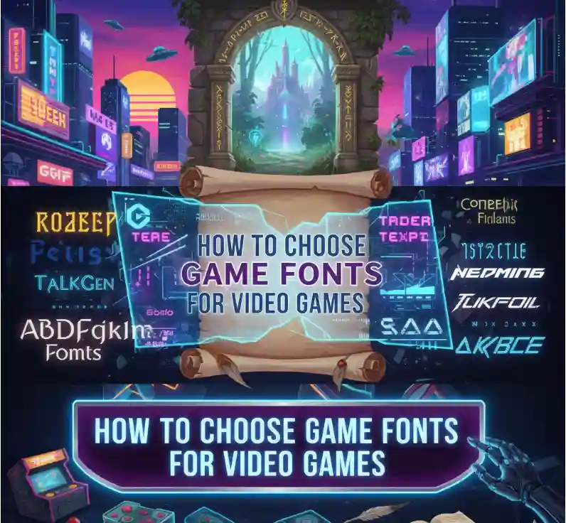
1. Introduction
Typography in video games isn’t just about text — it’s storytelling through letters. The right font builds atmosphere, enhances mood, and instantly tells players what kind of adventure awaits. Whether you’re designing a retro platformer, a futuristic sci-fi world, or a dark horror quest, font choice plays a crucial role in game identity.
This guide explains how to choose game fonts for video games that captivate players, improve usability, and strengthen your brand’s visual consistency.
2. Why Fonts Matter in Video Games
Typography impacts every player interaction — from title screens to dialogue boxes and scoreboards. The right font helps:
- Create strong visual identity
- Convey the emotional tone of the game
- Improve on-screen readability
- Build brand memorability
For instance, titles like DOOM, Minecraft, or The Legend of Zelda are instantly recognizable because their fonts capture the soul of their gameplay.
(Reference: Letterhend Blog – The Secret of Video Game Typography)
3. Understanding the Psychology of Game Typography
Each font evokes specific emotions and expectations:
- Serif fonts — evoke tradition, adventure, and fantasy worlds.
- Sans-serif fonts — feel modern, futuristic, and tech-driven.
- Display fonts — bold, memorable, perfect for titles or branding.
- Script fonts — mystical or elegant, often used in fantasy or magic settings.
Typography influences how players feel — sharp fonts may convey danger, while rounded fonts suggest friendliness.
4. Factors to Consider When Choosing Game Fonts
4.1 Readability and Legibility
Even the most stylish font must remain readable in fast gameplay. Use simple sans-serifs for HUD or menus, and decorative fonts for titles.
👉 Try Gunrace Display Font for impactful, easy-to-read action interfaces.
4.2 Genre and Theme Matching
Font style should always match the game’s atmosphere:
- Fantasy/RPG: serif or hand-drawn fonts like Adventure Land Font.
- Sci-Fi: futuristic styles like Games Space Display Font.
- Casual/Arcade: playful fonts like Finish Playing Font.
4.3 Emotional Tone and Atmosphere
Fonts express emotion — bold, angular letters feel aggressive; soft, rounded shapes appear friendly. Ensure the tone fits the intended emotion of the scene or genre.
4.4 Compatibility with Game Interfaces
Always test your fonts across devices and screen resolutions. A font might look perfect in a menu but cluttered in mobile gameplay. Adjust kerning, spacing, and contrast to ensure optimal visibility.
4.5 Licensing and Commercial Use
Always use fonts with proper commercial licensing. All RaisProject fonts come with flexible licenses suitable for both indie developers and professional studios — no copyright worries.
5. Top RaisProject Fonts for Game Design
At RaisProject, we design premium, high-impact fonts tailored for digital media and games. Here are some standout options:
- Adventure Land Font – Handcrafted style for adventure and RPG titles.
- Games Space Display Font – Sleek and futuristic, ideal for sci-fi or shooter games.
- Finish Playing Font – Modern and fun, suitable for casual and arcade gameplay.
- Gunrace Display Font – Powerful and bold, perfect for racing and action games.
All these fonts are crafted for screen use, feature multi-language support, and are commercially licensed for unlimited creative freedom.
6. Final Tips for Choosing the Perfect Game Font
- Test fonts in-game, not just in mockups.
- Combine 2–3 complementary fonts for UI hierarchy.
- Avoid over-decorative fonts for continuous text.
- Keep readability your top priority.
- Check how fonts look under motion, effects, or scaling.
7. Conclusion
Fonts shape first impressions. They tell your audience what kind of world they’re entering — fantasy, horror, or futuristic. The right font choice improves immersion, branding, and readability across your game’s visual ecosystem.
By following these principles and exploring RaisProject’s font collection, you’ll find the perfect typeface that transforms your game into a truly memorable experience.