
Table of Contents
- Introduction
- Why Font Choice Matters
- Understanding Font “Feeling” – What We Mean
- Key Principles for Picking Fonts That Feel Right
- 4.1 Match the Mood & Message
- 4.2 Consider Readability & Context
- 4.3 Use Font Psychology to Your Advantage
- 4.4 Combine Fonts Thoughtfully
- 4.5 Test and Iterate
- Practical Steps: From Brief to Final Font Choice
- How Our Font Library at RaisProject Can Help
- Common Mistakes to Avoid
- Conclusion
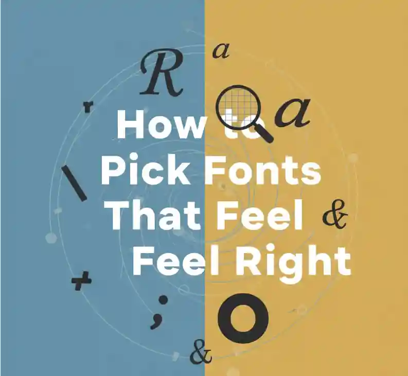
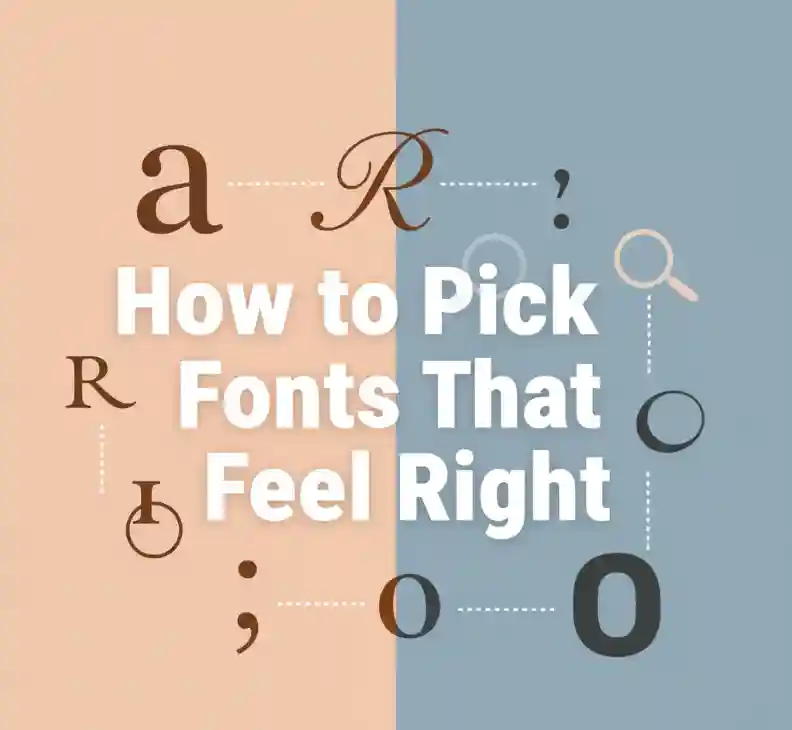
1. Introduction
When designing any visual content — from branding and packaging to websites and posters — your choice of font shapes how your message feels. Fonts carry emotional weight. A playful script font makes people smile, while a sharp sans-serif feels bold and confident.
In this article, you’ll learn exactly how to pick fonts that feel right — using design psychology, practical tips, and expert insights — and how our curated font library at RaisProject.com can help you find typefaces that perfectly fit your project’s mood.
2. Why Font Choice Matters
Typography is visual language. It communicates emotion even before words are read. According to Designmodo, fonts influence how people perceive your brand’s tone — from elegant and trustworthy to loud and disruptive.
Research published on PubMed Central found that rounded letterforms are perceived as more pleasant and easier to read, while angular ones convey strength and intensity.
In other words, fonts aren’t neutral. They speak volumes about who you are and what your message stands for — emotionally and visually.
3. Understanding Font “Feeling” – What We Mean
A font that “feels right” connects emotionally with your audience. It balances readability, mood, and identity.
- Mood or Tone: Is your project playful, elegant, or minimalist? Fonts carry emotional connotations.
- Brand Personality: Fonts shape perception. A serif font says “trustworthy,” while a handwritten one says “personal.”
- Readability & Function: Beautiful fonts fail if they can’t be read easily on screens or in print.
- Audience & Context: The perfect font for a fashion brand might feel wrong for a financial report.
For more insight into how typography impacts emotion, check out Adobe’s Design Blog on Type Psychology.
4. Key Principles for Picking Fonts That Feel Right
4.1 Match the Mood & Message
Fonts carry emotional energy. A serif font feels classic and reliable, a sans-serif modern and clear, and a script type romantic or artistic. Canva Design School recommends choosing fonts that mirror your message — elegant for luxury brands, rounded for friendly startups, etc.
4.2 Consider Readability & Context
Even the most stylish font is useless if it’s hard to read. Always test your font in real use — mobile screens, posters, or printed brochures. Typography expert Ellen Lupton emphasizes legibility as the foundation of good design (AIGA).
4.3 Use Font Psychology to Your Advantage
Font psychology explores how typeface characteristics evoke emotion:
- Serif → trustworthy, traditional
- Sans-serif → clean, modern
- Script → elegant, personal
- Display → bold, expressive
According to 99designs, understanding these traits allows brands to emotionally connect through typography rather than just decoration.
4.4 Combine Fonts Thoughtfully
Use font pairings strategically: one for headings, one for body. Contrast adds interest; consistency maintains harmony. For example, pair a bold sans-serif headline with a clean serif paragraph font.
4.5 Test and Iterate
Mock up your font choices, test with real content, and ask for feedback. What feels right in a design preview might shift when placed in a real-world context.
5. Practical Steps: From Brief to Final Font Choice
- Define your project’s audience and tone.
- Choose 2–3 descriptive emotion words (e.g., “modern,” “playful,” “refined”).
- Browse curated font categories (serif, sans-serif, script, display).
- Shortlist fonts that reflect your tone and purpose.
- Test readability across devices.
- Get peer or client feedback.
- Finalize and document your typography style for consistent branding.

6. How Our Font Library at RaisProject Can Help
At RaisProject, we design and curate fonts that help you pick fonts that feel right for every creative purpose. Here are some examples that align perfectly with the ideas in this guide:
- LEGENDRY Font — A handcrafted display font from Bandung and Garut, Indonesia. Strong and expressive, perfect for impactful logos and posters.
- Jabbing Fonts Family — A 3-style family (Serif Display Regular, Textured, Signature Script). Ideal for multi-tone branding needing both authority and personality.
- Gunrace Font — Racing-inspired, dynamic, and bold. Excellent for sports, gaming, or edgy lifestyle brands.
- Hand Signature Font — Elegant and handwritten, perfect for personal branding, fashion, or lifestyle visuals.
Discover more curated typefaces in our Shop section — where fonts are organized by mood (modern, classy, playful, bold) and usage (branding, UI, packaging, print).
7. Common Mistakes to Avoid
- Choosing fonts solely based on trends.
- Ignoring legibility and accessibility.
- Mixing too many font styles.
- Using fonts inconsistent with your brand personality.
- Forgetting to test on different screens and devices.
8. Conclusion
Fonts have power. The right font makes your message feel authentic, emotional, and memorable.
By combining design psychology, context awareness, and beautiful typography from RaisProject, you can create designs that don’t just look professional — they feel right.
Explore more at RaisProject.com and discover how typography can transform the way people experience your brand.
Reference Links