
Table of Contents
- What is Readability vs Legibility in UI?
- Why Readability Matters in User Interfaces
- Key Elements That Improve Readability
- 3.1 Font Choice: Serif, Sans-Serif, Display & Script
- 3.2 Size, Weight & Hierarchy
- 3.3 Spacing: Line Height, Letter Spacing, Paragraph Spacing
- 3.4 Contrast, Color & Backgrounds
- 3.5 Line Length, Alignment, and Layout
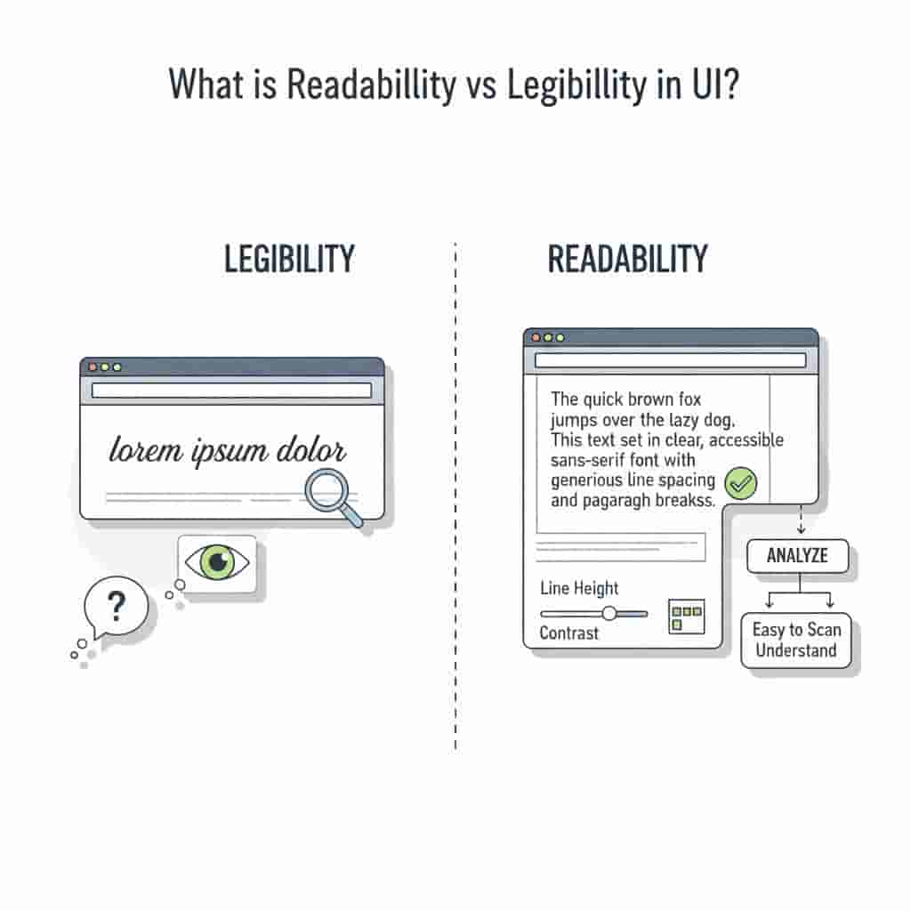
1. What is Readability vs Legibility in UI?
- Legibility refers to how easily individual characters (letters, numbers, symbols) can be distinguished from each other
- Readability is about howUX Planet+ 2Big Drop Inc+ 2
Both are critical in user interface (UI) design.
2. Why Readability Matters in User Interfaces
- Usability & Accessibility : If text is hard to read, users will misinterpret labels or ignore sections
- User Engagement & Retention : Interfaces with clear readable text reduce cognitive loadforgeandsmith.com+ 1
- Brand Perception & Professionalism : Typography communicates personality. Poor readability looks amateurish; good typography suggests care, trustworthiness, and attention to detail.Big Drop Inc+ 1
- Conversion & Efficiency : Clear info hierarchy (which depends heavily on typography)UX Planet+ 1
3. Key Elements That Improve Readability
Below are best practices and concrete factors to focus on when designing UI text. Many of these are backed by research and guidelines from design systems.
3.1 Font Choice: Serif, Sans-Serif, Display & Script
- Sans-Serif fonts are generally safer for body text in UI: cleaner strokes, fewer decorations, which helps at small sizes and on screens.
- Serif fonts can work for headings
- Display or Script fonts may be beautiful, but useful
- Also important: font design details such as high x-height (height of lowercase letters), open counters (eg inside letters like “o”, “e”), distinguishable shapes of characters. These help legibility at small sizes.uxdesign.cc+ 2UX Planet+ 2
3.2
- Always ensure body text is large enough (often around 16px or equivalent) for most devices. Smaller sizes may force squinting.medium.com+ 1
- Use different weights (light, regular, medium, bold) to distinguish headings, subheadings
- Use consistent typographic hierarchy: headings (H1, H2, H3…), subheadings, body, meta text.
- Avoid having too many levels of hierarchy which may confuse users.DeveloperUX+ 1
3.3 Spacing: Line Height, Letter Spacing, Paragraph Spacing
- Line height (leading) is typically ∼1.4-1.6× the font size helps text lines feel open, not cramped. Especially for long paragraphs.Medium+ 1
- Letter spacing (tracking or kerning) matters especially for uppercase or smaller sizes. Nearly always better to test and adjust.figma.com+ 1
- Paragraph spacing and margins (white space) help chunk content so the eye can rest. Big blocks of text without breaks are tiring.
3.4 Contrast, Color & Backgrounds
- Sufficient color contrast between text and background is non-negotiable for readability and accessibility (WCAG guidelines).
- Avoid using
- Be careful if you overlay text over images: include overlays or color backgrounds to maintain contrast.
- Consider ambient/light conditions (eg mobile in sunlight, dark mode) which affect
3.5 Line Length, Alignment, and Layout
- Line length: ideal length is often cited as 45-90 characters per line ; around 66 characters being a gooddesignsystem.digital.gov+ 1
- Text alignment: left-aligned (for left-to-right scripts) is easiest; centered or justified text can introduce uneven spacing or rivers of white space.US Web Design System (USWDS)+ 1
- Layout: headings should be easily distinguishable; navigation labels and button text should be clear; grouping of
4. Common Mistakes That Reduce Readability
- Using too many different fonts (families or weights) → inconsistency
- Small font sizes
- Poor contrast / low visibility text
- Overly decorative or script fonts are used where clean fonts are needed
- Crowded line spacing / cramped layouts
- Long blocks of text without breaks, lists, or subheadings
- Using all caps for large bodies of text – caps reduces recognition of word shapes
5. How to Test and Iterate for Readability in UI
- User Testing : Try with real users, especially those with vision difficulties. Collect feedback.
- Accessibility tools : Use contrast check
- Automated metrics : Analyze reading time, bounce rate, task success.
- A/B testing : Try alternatives
- Use design system guidelines : Material Design, Apple HIG, etc., as benchmarks.

6. How RaisProject Fonts Can Help in UI Readability
At RaisProject, our handmade fonts have been crafted with attention to detail: open counters, clean letterforms, various styles (sans-serif, serif, display),
Examples:
- Rodger Arnoud Font– a clean display font that also works well for headings or interface titles. Its strong
- I Am Beautiful Font– though more stylized, can be used carefully for headers or decorative UI elements (not body text), bringing personality without compromising clarity.
- Sans & Serif category fonts– for body copy or UI menus where clarity and neutrality are required; ideal for long reading or navigation elements.
Tips when using RaisProject fonts:
- Pair a more decorative font for headings (display/script) with a neutral sans-serif for body text.
- Use weight variations where available (light, regular, bold) from the same font family to maintain harmony.
- Test rendering at different screen sizes. Some handmade fonts may need adjustments in spacing when scaled down.
- Use proper licensing (we provide full licensing for UI/branding/video etc.) so you can deploy fonts without legal concerns.Rais Project Studio by Handmade Fonts
7. Conclusion
Improving readability in UI is not just a technical or aesthetic concern—it’s essential to usability, accessibility, and overall user satisfaction. By choosing the right fonts, implementing proper hierarchy, spacing, contrast, and layout, and testing with real users, you can make your interfaces more effective, inclusive, and pleasant to use. At RaisProject, our fonts are designed to give you both personality and clarity—you don’t have to sacrifice readability for style.
References & Further Reading
- “Principles of Typography in UI Design” (UX Planet)UX Planet
- “The Perfect Text Readability Recipe: Science-Backed Typography for Better UX” (Medium)Medium
- “Designing for Readability: A Guide to Web Typography” (Toptal)toptal.com
- “How to be strategic when choosing a typeface” (UX Design)UX Collective