
Table of Contents
- Introduction
- What Is Kinetic Typography?
- A Brief History of Kinetic Typography in Film
- Why Kinetic Typography Matters in Modern Filmmaking
- Key Techniques and Styles of Kinetic Typography
- How Filmmakers Use Typography to Convey Emotion
- The Role of Fonts in Kinetic Typography
- Best Font Recommendations for Kinetic Typography Projects
- Software and Tools Used for Creating Kinetic Typography
- The Future of Kinetic Typography in Film
- Conclusion
- References
1. Introduction
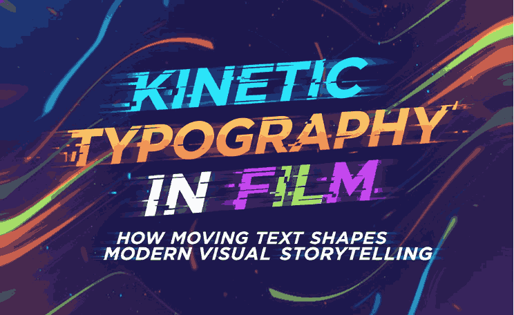
Kinetic Typography in Film has become one of the most powerful visual techniques in modern filmmaking, motion graphics, and digital storytelling. From movie trailers to opening credits and dramatic scenes, moving text helps guide the viewer’s emotions, pace, and interpretations. As filmmakers push creative boundaries, typography evolves from a static communication tool into a dynamic visual force.
This article explores how kinetic typography in film works, why it’s so effective, and how the right fonts can dramatically elevate your visual narrative.
2. What Is Kinetic Typography in Film?
Kinetic typography refers to text that moves, transforms, or animates to enhance storytelling. This can include:
- Text that slides, rotates, or zooms
- Words that appear in sync with speech
- Letters that break apart and re-form
- Rhythmic or expressive movement tied to soundtrack or dialogue
Essentially, kinetic typography blends motion design, graphic design, and typography to create emotional and immersive text experiences.
3. A Brief History of Kinetic Typography in Film
While kinetic typography feels modern, its roots go back to:
- 1960s motion graphics pioneers like Saul Bass
- Iconic film intros such as Psycho (1960)
- Early digital animation experiments
- MTV-era music videos that embraced bold type motion
- Modern streaming platforms that popularized minimal, clean animation styles
Over time, it evolved into a standard storytelling tool used by Hollywood studios and digital creators alike.
4. Why Matters in Modern Kinetic Typography in Film
Filmmakers use kinetic typography to:
Enhance emotional impact Kinetic Typography in Film
Movement and timing amplify the mood—fast motion conveys excitement, while slow movement creates suspense.
Guide viewer attention Kinetic Typography in Film
Animated text highlights what the audience should focus on.
Strengthen narrative Kinetic Typography in Film
Typography can act as a character, metaphor, or tone setter.
Modernize visual style Kinetic Typography in Film
Even simple motion text instantly gives a film a contemporary look.
5. Key Techniques and Styles of Kinetic Typography in Film
Some of the most popular styles include:
- Scrolling text (Star Wars–style openings)
- Synced dialogue text
- Scale and rotation animation
- Liquid movement typography
- Type morphing and letter stretching
- Fast-cut kinetic sequences for action scenes
- Minimal floating titles for drama or mystery films
Each method allows filmmakers to match typography with the film’s energy and rhythm.
6. How Filmmakers Use Typography to Convey Emotion
Typography influences emotional tone in several ways:
Font style
- Serif = Classic, serious
- Sans-serif = Clean, modern
- Bold = Strong and dramatic
- Curved = Friendly or emotional
Motion behavior
- Fast = Urgency or chaos
- Slow = Calmness or intensity
- Staggered movement = Mystery or tension
Color and spacing
Warm or cool tones shift the atmosphere, while spacing affects readability and rhythm.
When used together, fonts and motion create a synchronized emotional experience for the viewer.
7. The Role of Fonts in Kinetic Typography
Fonts determine the “voice” of the animated text.
The right font will:
- Animate smoothly
- Maintain clarity at various speeds
- Look expressive when scaled or rotated
- Match the tone of the film
Choosing well-designed fonts is crucial for kinetic typography success.
8. Best Font Recommendations for Kinetic Typography Projects
Here are curated font suggestions from Raisproject.com that work beautifully for motion design:
1. Bitrate Font
Perfect for digital, tech, sci-fi, and fast-paced kinetic scenes.
2. Motorace Font
A dynamic and aggressive font ideal for action films, racing scenes, and intense motion sequences.
3. Hustle Run Font
Energetic and modern—great for fast, rhythmic text animations and bold cinematic visuals.
These fonts maintain strong readability even during rapid movement, making them excellent choices for professional motion graphics.
9. Software and Tools Used to Create Kinetic Typography
Popular tools among filmmakers include:
- Adobe After Effects – industry standard
- Blender – powerful open-source 3D motion software
- Cinema 4D – excellent for 3D typography
- DaVinci Resolve Fusion – film-grade motion graphics
- Final Cut Pro – great for simple kinetic text
- Canva / CapCut – user-friendly for beginners
10. The Future of Kinetic Typography in Film
As technology evolves, so does motion typography. Future trends include:
- AI-assisted animated typography
- Real-time 3D text for virtual production
- Interactive typography in AR and VR films
- Audioreactive text animations
- Neural style transfer for type animation
Filmmakers will continue merging typography with immersive digital media to push storytelling boundaries.
11. Conclusion
Kinetic typography is more than moving text—it is a visual language that shapes emotional depth, narrative rhythm, and film identity. With the right font choices, filmmakers can transform simple words into powerful cinematic moments.
If you want to bring your film or motion projects to life, explore high-quality typography options at Raisproject.com, including Bitrate, Motorace, and Hustle Run—each designed to animate beautifully.