
Table of Contents
- Introduction
- What Is the Mandela Effect?
- The Mandela Effect in Typography
- Why We Misremember Fonts
- Famous Logo Fonts People Remember Incorrectly
- Psychological Reasons Behind Font Memory Errors
- Mandela Effect in Digital Branding
- Font Alternatives for Creative Projects
- RaisProject Font Recommendations
- Conclusion
- References
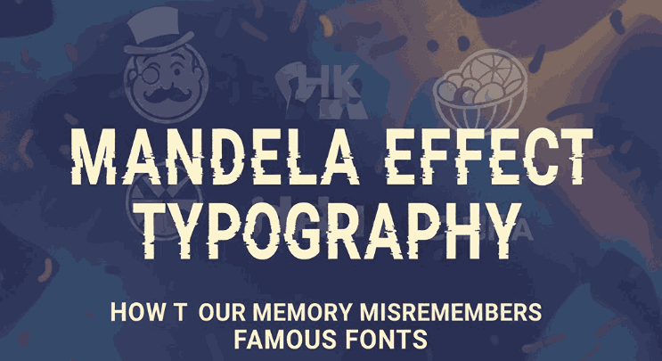
1. Introduction Mandela Effect Typography
Mandela Effect Typography is more than visual design — it shapes how we perceive brands, stories, and cultural memories. Yet, our memory is not always reliable. In recent years, the concept of the Mandela Effect has gained popularity, referring to instances where large groups of people recall an event or detail incorrectly.
Surprisingly, typography is one of the areas most affected by this phenomenon. Iconic logos, famous fonts, and brand lettering are often misremembered, leading to passionate debates online about “what the font used to look like.” This fascinating mix of psychology, visual design, and collective memory is what we call Mandela Effect Typography.
This article explores why our brains misidentify fonts, famous examples, and how designers can use this knowledge to create more memorable brand experiences.
2. What Is the Mandela Effect Typography?
The Mandela Effect refers to collective false memories. The term was coined after many people believed that Nelson Mandela died in prison in the 1980s — despite him being released and later becoming President of South Africa.
The phenomenon extends into:
- Pop culture
- Movie quotes
- Brand names
- Logos
- Typography
In typography, the Mandela Effect highlights how easily our visual memory can alter details of fonts and letterforms we see daily.
3. The Mandela Effect Typography
Typography-related Mandela Effects often involve:
- Logo fonts appearing thicker or thinner than remembered
- Letters having different curves or angles
- Brand names seeming spelled incorrectly
- People “remembering” serif fonts where none existed
- Shapes of letters being mentally reconstructed
For example, many people misremember the fonts used in logos like:
- Coca-Cola
- KitKat
- Looney Tunes
- Monopoly
- Fruit of the Loom
The phenomenon shows that even widely recognized typography is vulnerable to human memory errors.
4. Why We Misremember Fonts
There are several reasons why fonts are easy to misremember:
1. The Brain Simplifies Visual Information
Our brain compresses complex shapes into simplified memory patterns.
2. Familiarity Breeds Assumption
The more we see a brand, the more we assume we remember its exact font — even if we don’t.
3. Influences from Similar Fonts
Fonts like Helvetica, Ariel, and Gotham often blur together in our memory.
4. Emotional Attachment Mandela Effect Typography
Nostalgia often distorts how we recall visual details.
5. Exposure to Incorrect Versions Mandela Effect Typography
Fake logos or fan-made recreations online may overwrite real memories.
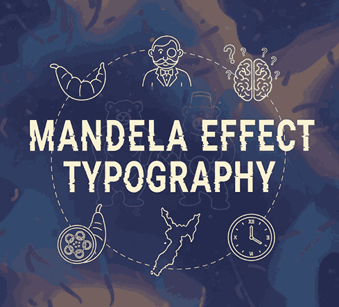
5. Famous Logo Fonts People Misremember
Here are some widely debated examples:
• Fruit of the Loom Mandela Effect Typography
Many believe it had a cornucopia behind the fruits — but it never did.
• KitKat
Some remember a hyphen (“Kit-Kat”), even though the official logo shows no hyphen.
• Looney Tunes
People recall it spelled “Looney Toons,” influenced by the word “cartoons.”
• Volkswagen
Some swear the “V” and “W” used to touch, but they never did.
These false memories often include incorrect fonts or modified lettering.
6. Psychological Reasons Behind Font Memory Errors
The Mandela Effect in typography occurs due to:
• Pattern Recognition Bias
We remember familiar shapes, not precise details.
• Priming Mandela Effect Typography
Similar-looking fonts prime our memory to assume specific details.
• Emotional Memory Mandela Effect Typography
We remember how a logo felt, not how it looked.
• Cognitive Overload Mandela Effect Typography
Logos are processed quickly, creating “memory shortcuts.”
Typography thus becomes a perfect target for collective misremembering.
7. Mandela Effect Typography in Digital Branding
In the digital age, thousands of “fan edits” or altered logos spread across social media. When people repeatedly see altered designs, their memory adapts — making the incorrect version feel right.
This challenges brands to maintain:
- Consistent typography
- Clear brand guidelines
- Visual identity integrity
Brands with long histories (Disney, Ford, Coca-Cola) are particularly affected due to nostalgic expectations.
8. Font Alternatives for Creative Projects
Given how easily people misremember iconic fonts, designers today prioritize creating typefaces that are:
- Unique
- Memorable
- Emotionally expressive
- Easy to identify
- Hard to confuse with others
This is where custom fonts from RaisProject become valuable for branding, packaging, websites, and digital storytelling.
9. RaisProject Font Recommendations
To support your article visually, here are recommended mockup fonts from your website:
1. Aday Font
A versatile sans serif with multiple styles (Regular, Italic, Outline, Bold, etc.)
Perfect for demonstrating how slight variations in typeface can create major memory differences.
2. Agrozza Font
Futuristic, geometric, and strong — ideal for memorable branding.
Its bold uppercase letters help show how distinct typography reduces misremembering.
3. The Ruler Font
Modern decorative sans serif with multi-style options.
Great for illustrating how typography variations can trick or shape people’s memory.
These fonts can help inform readers how design choices influence memory, perception, and emotional resonance.
10. Conclusion
Mandela Effect Typography shows how our memories of fonts and logos are often inaccurate, reshaped by exposure, nostalgia, and visual assumptions. As designers, understanding this phenomenon helps us craft typography that is more recognizable, consistent, and emotionally impactful.
By using unique and purposeful fonts — like Aday, Agrozza, and The Ruler from RaisProject — creators can establish strong brand identities that resist confusion and stay unforgettable.
Typography is more than aesthetics — it is a powerful tool in shaping how the world remembers.
11. References Mandela Effect Typography
- PsychologyToday — What Is Memory?
- National Geographic — The Mandela effect tricks our brains with false memories
- Neuroscience News — Study Finds Widespread False Memories of Logos and Characters
- Letterhend — The Mandela Effect in Typography: When Our Memory Misidentifies Famous Fonts