
Table of Contents
- Introduction: Why Modern Calligraphy Matters
- What is Modern Calligraphy?
- Simple Techniques to Get Started
3.1. Choose the Right Tools
3.2. Learn the Basic Strokes
3.3. Practice Consistently and Mindfully - Applying Calligraphy to Your Typography Work
- How Fonts from RAIS Project Can Support Your Calligraphy Projects
- Troubleshooting Common Mistakes
- Summary & Next Steps
- References
1. Introduction: Why Modern Calligraphy Matters
In a world dominated by digital design, modern calligraphy remains one of the most personal and artistic forms of visual expression. From wedding invitations to brand logos, mastering this skill gives your work a unique, handcrafted touch that digital fonts alone can’t replicate.
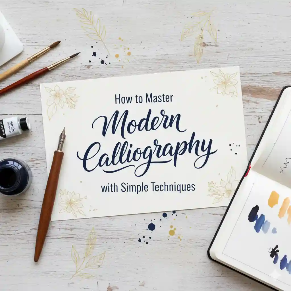
In this article, we’ll explore How to Master Modern Calligraphy with Simple Techniques — practical steps for beginners and designers, plus how you can use calligraphic principles to enhance your own font design projects at RAIS Project.
2. What is Modern Calligraphy?
Modern calligraphy blends the discipline of traditional calligraphy with the freedom of artistic expression. Unlike the strict structure of classical scripts like Copperplate or Spencerian, modern calligraphy allows variation in letter size, slant, and rhythm.
According to Lettering Daily, modern calligraphy “focuses on developing a personal style through understanding basic strokes and composition.”
The Postman’s Knock also describes it as “an accessible, expressive, and forgiving form of art that anyone can learn.”
This flexibility makes it ideal for artists, designers, and font creators who want to infuse warmth and authenticity into digital designs.
3. Simple Techniques to Get Started
3.1. Choose the Right Tools
You don’t need expensive materials to start modern calligraphy — just the right ones. Essential tools include:
- Brush pens or flexible nib pens
- Smooth, bleed-resistant paper
- Pencil and ruler for guidelines
Lettering Daily recommends brush pens like Tombow or Pentel for beginners because they provide consistent stroke variation.
If you’re practicing with digital inspiration, check out the Lithonia Calligraphy Font from RAIS Project — it perfectly captures the fluid, handcrafted look of modern calligraphy.
3.2. Learn the Basic Strokes
Every letter in calligraphy is built from a few essential shapes: underturns, overturns, ovals, and loops. Mastering these before moving to full letters is crucial.
As Vial Designs explains, “each letter is formed by combining basic strokes, so learning these first helps build consistency and muscle memory.”
Follow this golden rule: thin upstrokes and thick downstrokes. That’s the foundation of all calligraphic contrast.
You can compare your drills with how professional script fonts maintain stroke variation — for instance, the Secret Action Font from RAIS Project showcases natural, elegant contrast between up and down strokes.
3.3. Practice Consistently and Mindfully
Calligraphy is a blend of art and meditation. Practicing for just 10–15 minutes a day helps you internalize stroke rhythm and control.
Here’s a simple routine recommended by The Happy Ever Crafter:
- Warm up with basic drills.
- Write simple letters.
- Combine them into short words.
Practicing slowly and deliberately allows you to focus on stroke pressure and spacing.
For inspiration, try tracing digital calligraphy fonts like Lithonia Calligraphy Font — it’s a great reference for flow and composition.
4. Applying Calligraphy to Your Typography Work
If you design fonts, calligraphy principles can significantly improve your results. Calligraphy teaches balance, proportion, and rhythm — fundamentals of great type design.
Here’s how to apply it:
- Use calligraphy sketches as the basis for new fonts.
- Incorporate “bounce lettering” to make letterforms more lively.
- Add stylistic alternates and ligatures inspired by real brush strokes.
As Typewolf notes, many famous typefaces originate from handwritten calligraphic sketches.
For example, RAIS Project’s Lithonia Calligraphy Font showcases how organic brush motion translates into digital typography.
5. How Fonts from RAIS Project Can Support Your Calligraphy Projects
RAIS Project offers beautifully handcrafted fonts that align perfectly with modern calligraphy aesthetics:
- Lithonia Calligraphy Font — elegant and fluid, ideal for branding, invitations, or design practice.
- Secret Action Font — bold and expressive, it reflects the confidence of advanced calligraphy strokes.
- Shop the Full Collection — explore hundreds of creative script and handwritten fonts to complement your projects.
Using these fonts can inspire your personal calligraphy journey while giving your digital work a handcrafted charm.
6. Troubleshooting Common Mistakes
| Mistake | Cause | Fix |
|---|---|---|
| Uneven thickness | Poor pressure control | Slow down and focus on stroke direction |
| Shaky lines | Writing from wrist | Move from shoulder/arm for smoother flow |
| Irregular spacing | No guidelines | Always draw baselines and x-height |
| Ink bleeding | Rough paper | Use smooth, high-quality paper |
| Lack of improvement | Inconsistent practice | Commit to short daily sessions |
For further guidance, John Stevens Design offers advanced insights into stroke control and spacing for both beginners and professionals.
7. Summary & Next Steps
Learning how to master modern calligraphy is a rewarding creative journey. With patience, practice, and the right resources, you’ll soon see progress in both your handwriting and design work.
To recap:
- Start with proper tools and guidelines.
- Master the basic strokes first.
- Practice daily with mindfulness.
- Study professional examples — both handwritten and digital.
- Incorporate your knowledge into typography projects.
Visit RAIS Project’s Font Shop to find inspiration in professionally crafted fonts that embody the soul of modern calligraphy.