
Table of Contents
- Introduction: Why Luxury Brands Choose Simplicity
- What Is Simple Luxury Typography?
- The Psychology Behind Minimal and Elegant Typeface Choices
- Key Principles of Simple Luxury Typography
- Best Font Characteristics for Luxury Visual Identity
- Simple Luxury Typography Examples from RaisProject
- How Designers Can Use Luxury Typography in Branding
- Tips for Combining Fonts in Luxury Designs
- Final Thoughts
- References
1. Introduction: Why Brands Choose Simple Luxury Typography
Simple Luxury Typography brands across the world—from high-fashion labels to premium skincare and jewelry houses—tend to use typography that is clean, minimal, and timeless. Instead of decorative or overly stylized designs, they rely on subtlety and restraint to communicate sophistication.
This trend is at the core of what we call Simple Luxury Typography—a design approach that elevates elegance through simplicity. Whether you’re developing logos, packaging, UI design, or marketing materials, understanding this concept is essential for achieving a premium visual identity.
2. What Is Simple Luxury Typography?
Simple Luxury Typography refers to the design philosophy where brands use clean, minimal, and refined typefaces to express elegance, exclusivity, and premium value.
It focuses on:
- minimal shapes
- balanced proportions
- subtle visual harmony
- strategic use of negative space
This style might seem simple, but it is extremely intentional—and that intention is what makes luxury branding feel exclusive.
3. The Psychology Behind Minimal and Elegant Typeface Choices Simple Luxury Typography
Luxury brands avoid unnecessary complexity because simplicity helps communicate:
✓ Trustworthiness Simple Luxury Typography
Minimal typography gives a sense of structure and clarity, making a brand appear more reliable.
✓ Exclusivity Simple Luxury Typography
Clean lines evoke a premium, high-end atmosphere that feels curated and selective.
✓ Timelessness Simple Luxury Typography
While decorative fonts may go out of style, minimalistic luxury fonts remain relevant for decades.
✓ Confidence Simple Luxury Typography
A luxury brand doesn’t need loud designs—confidence comes from refinement and subtle presence.
These psychological triggers make simple typography incredibly powerful in luxury brand communication.
4. Key Principles of Simple Luxury Typography
To design with a luxury aesthetic, follow these essential rules:
1. Less Is More
Use typefaces that are clean and uncluttered.
2. Elegant Letter Spacing
Luxury designs often use slightly increased tracking (letter spacing) to give a spacious, breathable feel.
3. High Contrast
Thin strokes paired with balanced proportions create a premium visual tone.
4. Consistency in Branding
Limit your typeface choices to one or two fonts for a cohesive identity.
5. Premium Color Palettes
Typography becomes even more luxurious when paired with black, cream, gold, or muted tones.
5. Best Font Characteristics for Simple Luxury Typography Visual Identity
Fonts that embody Simple Luxury Typography typically have:
- thin or medium-weight strokes
- clean geometric or neo-classical shapes
- high contrast between thick and thin areas
- clearly defined serifs or sleek sans-serif forms
- strong legibility
These characteristics create a premium aesthetic ideal for logos, packaging, editorials, and branding projects.
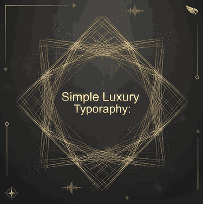
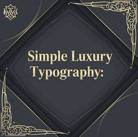
6. Simple Luxury Typography Examples from RaisProject
Your own font collection at RaisProject offers excellent examples that fit this luxury style.
Here are four recommended fonts for your blog article:
1. Gendisa Font
A sleek serif typeface with elegant curves and refined details—perfect for beauty, fashion, and jewelry branding. Its balanced contrast gives it a premium look suitable for logos and editorial layouts.
2. Longless Font
A modern minimalist sans serif with clean geometry. Longless carries sophistication through simplicity, making it ideal for luxury tech, boutique brands, and high-end product packaging.
3. Ryalie Aurea Font
Designed with elegance in mind, this font embodies the essence of simple luxury. It features refined strokes and a classy overall presence—great for branding, magazine covers, or premium labels.
4. Ailura Sydney Font
A stylish serif font with soft curves and high readability. Ailura Sydney delivers a timeless luxury feel suitable for feminine brands, skincare products, and minimalist fashion logos.
7. How Designers Can Use Simple Luxury Typography in Branding
Here are effective ways to apply luxury typography:
✓ Logo Design
Use serif or minimalist sans serif typefaces with generous spacing.
✓ Packaging
Luxury packaging relies heavily on minimalistic text layouts with strong visual hierarchy.
✓ Website & UI
Clean typography enhances the premium user experience.
✓ Editorial / Magazine Layouts
Using minimal, well-spaced type creates an elegant and professional look.
8. Tips for Combining Fonts in Simple Luxury Typography Designs
- Pair a thin serif with a clean sans serif for balance.
- Avoid overly decorative script fonts—keep things minimal.
- Maintain spacious margins and avoid clutter.
- Use no more than 2 fonts per brand identity for consistency.
9. Final Thoughts Simple Luxury Typography
Simple Luxury proves that elegance doesn’t require complexity. The world’s most iconic luxury brands succeed not because their typography is loud—but because it is subtle, intentional, and sophisticated.
By choosing the right fonts and understanding the psychology behind minimal design, you can create branding that feels exclusive, premium, and timeless.
RaisProject fonts—like Gendisa, Longless, Ryalie Aurea, and Ailura Sydney—offer the perfect foundation for designers who want to elevate their luxury branding projects.
10. References Simple Luxury Typography
- LetterHend Studio — Why Do Luxury Brands Choose Minimalist Fonts?
- Zazzle — Luxury Script Font Simple Typography Finally Napkins
- Behance — The World’s Best Creators Are On Behance
- Envanto — Luxury Fonts