
Table of Contents
- What Defines Retro & Futuristic Typography
- Why Combine Retro and Futuristic Styles
- Key Design Principles for Mixing the Two
- Practical Tips & Techniques
- Font Pairing Ideas & Examples
- Mistakes to Avoid
- Case Studies & Inspiration
- Applying It with RaisProject Fonts
- Conclusion
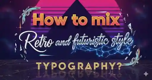
1. What Defines Retro & Futuristic Typography
Before you try to mix them, it’s useful to understand what makes a style retro vs futuristic in typography.
- Retro typography refers to designs inspired by past eras: vintage, mid-
- Futuristic typography often draws on sci-fi, minimalism, techno aesthetics, geometric forms, clean lines, monoline
Knowing what visually “codes” each style helps
2. Why Combine Retro and Futuristic Styles
Mixing retro + futuristic can produce designs that feel:
- Unique: because the combination is unexpected
- Timeless: leveraging nostalgia while also feeling modern
- Evocative: triggers emotional response (nostalgia + aspiration)
- Versatile
Also in crowded markets, such combinations can help a brand stand out.
3. Key Design Principles for Mixing the Two
To make the blend work, certain design principles are essential:
- Contrast & Balance : Balance the more decorative / textured retro elements with clean futuristic shapes. Contrast in weight,
- Hierarchy : Use typography hierarchy so that retro/futuristic mix doesn’t confuse readability. Decide which style
- Consistency in Color & Texture : Even if mixing styles, color palette or texture treatment should unify — eg metallic gradient retro might use futuristic neon, but matching tones or gradients
- Spacing & Proportion : Futuristic tends toward more whitespace, sharp spacing; retro sometimes denser or more ornamented. Be mindful so the layout remains coherent.
- Contextual Relevance : Know what your audience expects. A design for a sci-fi game poster will differ from a coffee shop logo wanting retro vibes.
4. Practical Tips & Techniques
Here are actionable ways to combine retro+
- Layering Effects : Use a retro font overlaid with futuristic shapes or glows, or vice versa. Eg bold retro serif with futuristic neon outline.
- Dual font pairing : One font is retro, another is futuristic. For example, headline in futuristic sans serif with subheadline or footer in a retro script or display font.
- Hybrid fonts :
- Color & Material Effects : Metallic texture, chrome, neon glows, space gradients (futuristic
- Use of Shadows & Depth : Long shadows, bevel, embossed (retro), with flat futuristic elements.
- Geometric Retro Icons & Layouts : Pair retro geometric patterns (chevrons, circles, sunburst) with futuristic

5. Font Pairing Ideas & Examples
Here are some practical examples / pairings, with font suggestions (including some from RaisProject), to show what
| Use Case | Retro Style Font | Futuristic Style Font | Why It Works |
|---|---|---|---|
| Logo for a tech | A decorative serif or vintage script | Sleek sans serif with geometric forms | Retro gives personality, futuristic gives modern credibility |
| Poster or event title | Bold retro display or script | Minimum | High contrast, good visual hierarchy |
| Branding for music/entertainment | Funky retro display (70s/80s) | Experimental futuristic for accents | Energy + |
RaisProject Font Examples
Here are some fonts from RaisProject that are suitable for mixing retro + futuristic styles:
- Venus Time Font — its display & stylized letterforms can lean retroraisproject.com
- Planet Driver Font — dynamic, display-style, could pair with clean futuristic sans for contrast.raisproject.com
- Backcrose Font — decorative display fonts like this can bring retro flair when paired with minimal futuristic type.raisproject.com
You might try a combination like Venus Time (for headline) + a clean geometric sans from RaisProject or external source for body text.
6. Mistakes to Avoid
When mixing styles, these
- Over-decorating: adding too many retro ornaments making the text cluttered.
- Too much contrast without harmony: combining fonts that clash in weight, shape, mood
- Ignoring readability: decorative retro scripts may look cool but be hard to read especially at small size.
- Overusing effects: too many gradients, shadows, textures can distract.
- Losing brand identity: make sure the mixture still aligns with what the brand wants to communicate.
7. Case Studies & Inspiration
Looking at real designs can help:
- Retro-futuristic movie posters (eg Blade Runner , Tron ) — neon, chrome, past meets future.
- Album covers that mix 80s vaporwave aesthetics with clean modern fonts
- Branding for tech festivals that includes vintage typography elements (like Art Deco or 70s style) + futuristic motifs (glitches, neon edges).
Also, examining successful font shops / marketplace typographic

8. Applying It with RaisProject Fonts
Here are steps to apply these principles using RaisProject’s catalog:
- Explore display and script categories : For retro flair, check Brush , Duos , Calligraphy , or Display fonts from RaisProject. These often have expressive forms.Rais Project
- Select a futuristic pairing : Either clean Sans Serif / Serif / monoline fonts from
- Test combinations : Try “headline in retro font – subheading/body in futuristic font”. Use mockups
- Apply effects and color carefully : For example, give the retro font a slightly aged texture, and the futuristic one a glow or metal sheen.
- Refine spacing, alignment, scaling to ensure visual harmony: eg size differences between headline/subheadline, kerning
9. Conclusion
Mixing retro and futuristic typography can produce striking, memorable designs when done thoughtfully. By understanding what makes each style, balancing contrast, using careful pairing,
If you’re looking for fonts that help you do exactly that, check out RaisProject’s Venus Time Font , Planet Driver Font , Backcrose Font , plus other display / duo style fonts in our shop.
References
Retro Design Trends – Creative Bloq
Futuristic Typography Trends – 99Designs
History of Typography – Canva