
Table of Contents
- Introduction
- What Is Typography’s Role in Misinformation?
- How Fonts Influence Trust, Credibility, and Perception
- Typography in the Age of Social Media
- Font Psychology: Why Certain Fonts Feel More “Truthful”
- Best Typographic Practices to Combat Misinformation
- Font Recommendations for Designing Trustworthy Visuals
- Conclusion
- References
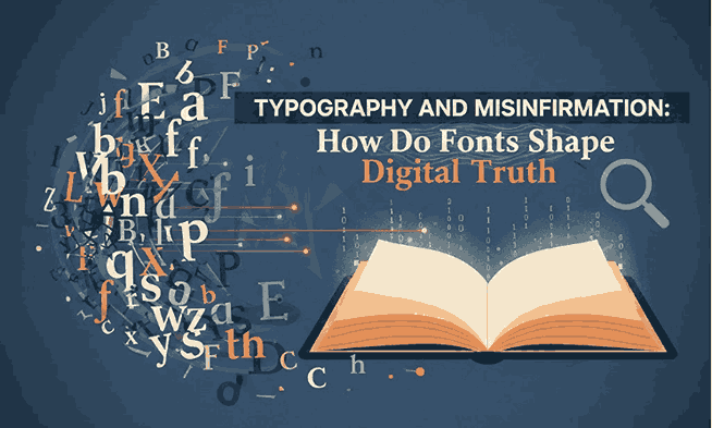
1. Introduction Typography and Misinformation
Typography and Misinformation In today’s hyper-connected digital world, misinformation spreads faster than ever. Whether it’s fake news, manipulated images, or misleading social media posts, misinformation thrives on speed, emotion, and visual impact. Surprisingly, one of the silent yet powerful elements that influences this spread is typography.
Typography is not merely a design decoration—it shapes perception, trust, and emotional response. This makes it a critical tool in either amplifying or preventing misleading content. In this article, we explore how typography relates to misinformation and how designers can use the right fonts to build clarity, trust, and authenticity in the digital space.

2. What Is Role in Typography and Misinformation?
Typography carries visual cues that influence how people interpret information. Misleading content often uses aggressive, dramatic, or overly stylized fonts to trigger urgency or fear, making readers less likely to question what they see.
Certain typographic choices help misinformation spread by:
- Creating false authority
- Mimicking credible institutions
- Stimulating emotional reactions
- Enhancing visual virality
- Distorting readability to confuse viewers
When used intentionally and ethically, typography can counteract these effects and promote transparency.
3. How Fonts Influence Trust, Credibility, and Perception
Research in visual psychology shows that typography directly affects how trustworthy information appears. Serif fonts, for example, are widely associated with professionalism and credibility, making them common in newspapers, journals, and official statements.
Typography influences perception through:
- Form & Structure – Rounded fonts feel friendly; sharp fonts feel urgent.
- Weight – Bold fonts command attention; light fonts suggest elegance.
- Spacing – Tight spacing feels dense and overwhelming; open spacing enhances clarity.
- Consistency – Inconsistent typography is often perceived as suspicious or unprofessional.
This influence is so significant that misinformation campaigns often use typography strategically to appear more legitimate.
4. Typography and Misinformation in the Age of Social Media
On platforms like Facebook, TikTok, X (Twitter), and Instagram, typography is often simplified, bolded, or condensed to increase speed of consumption. This makes misinformation easier to spread—users scroll quickly and respond primarily to visual cues.
Social media typography trends that amplify misinformation include:
- Dramatic bold condensed fonts
- Extremely high contrast color palettes
- Overuse of caps-lock typography
- Sensational styles similar to propaganda posters
To counteract this, designers must prioritize readability, calmness, and balanced type hierarchy.
5. Font Psychology: Why Certain Fonts Feel More “Truthful”
Font psychology explores how different typefaces evoke emotional associations. In the context of misinformation:
Fonts That Feel Trustworthy
- Serif fonts (traditional, authoritative)
- Minimalist sans-serifs (clean, rational)
- Elegant high-contrast serif fonts (professional, refined)
Fonts Often Used in Typography and Misinformation
- Distressed, grunge, or glitch fonts (chaotic, dramatic)
- Heavy condensed display fonts (urgent, alarming)
- Stylized novelty fonts (manipulative, emotional)
Typography alone cannot verify truth—but it influences whether people pause and think critically before accepting information.
6. Best Practices to Combat Typography and Misinformation
Designers can use typography to encourage clarity and critical thinking:
1. Prioritize Readability Typography and Misinformation
Use clean, high-legibility fonts for informational content.
2. Maintain Visual Hierarchy Typography and Misinformation
Headline, subheadline, and body text must guide the reader logically.
3. Use Responsible Emphasis
Bold text should highlight key points, not manipulate emotions.
4. Avoid Sensationalist Type Styles
Overly dramatic fonts mimic the look of clickbait and propaganda.
5. Encourage Transparency Typography and Misinformation
Fonts with balanced shapes, moderate contrast, and clean spacing help readers feel comfortable and informed.
Typography becomes an ethical responsibility for designers working in digital communication.

7. Font Recommendations for Designing Trustworthy Visuals
Here are some font recommendations from Raisproject that support clarity, authority, and professionalism—perfect for combatting misinformation:
1. Longless Font
A clean and elegant serif font ideal for trustworthy editorial content and factual messaging.
2. Rubellas Font
A modern serif typeface with refined strokes, excellent for professional articles, reports, and high-credibility layouts.
3. The Ruler Font
A bold and clean sans-serif font that enhances readability and conveys confidence without being aggressive.
4. Gailla Elegant Font
Luxurious yet balanced, perfect for headlines that require sophistication, authority, and clarity.
Using trustworthy typography in your designs not only elevates visual quality but also helps fight misinformation by creating a more honest digital environment.
8. Conclusion Typography and Misinformation
Typography plays a central role in how people perceive truth in the digital world. While misinformation relies on visual manipulation, ethical typography emphasizes clarity, professionalism, and trust. Designers have the power to shape how information is interpreted—one typeface at a time.
By choosing fonts wisely and designing responsibly, we can contribute to a more transparent, informed, and discerning online community.
9. References
- Nieman Lab – Digital media research
- Nielsen Norman Group – UX & readability research
- Poynter Institute – Journalism & misinformation studies
- MIT Media Lab – Research on misinformation & digital behavior
- W3C Web Accessibility Initiative – Readability & typography guidelines