
Table of Contents
- Introduction
- What “Futuristic Typography” Means in 2050
- Key Visual Principles to Use Today
- Practical Workflow: Tools & Techniques
- Font Examples & Inspo from RaisProject
- Future-Proofing: Accessibility, Sustainability, and AI
- Conclusion
- References
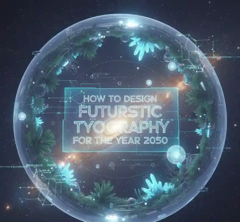
1. Introduction
The look and function of type have always evolved with technology. As we approach 2050, typography will not only convey words — it will react, move, adapt, and even respond to human context. This guide gives practical, actionable steps to help you design fonts today that feel ahead of their time tomorrow.
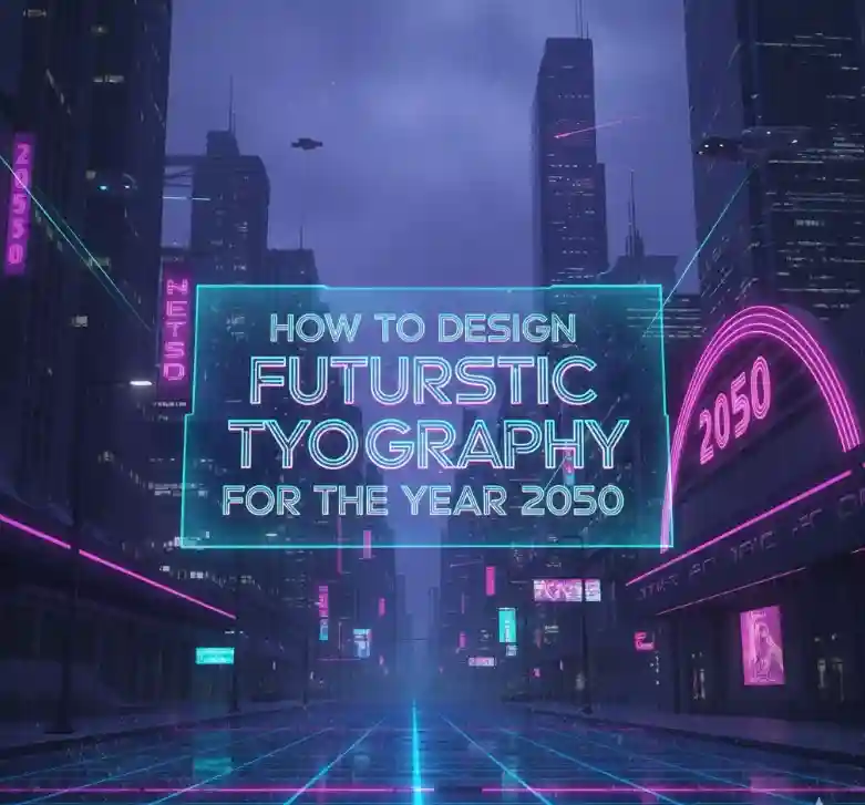
2. What “Futuristic Typography” Means in 2050
Futuristic typography is more than a sci-fi aesthetic: it’s an approach that combines adaptive behaviour, multi-dimensional presentation (3D, AR, holography), and optimization for intelligent interfaces. Thought experiments and industry commentary predict fonts that change according to user context (lighting, emotion, device) and that integrate motion or tactile feedback. For background reading on these emerging ideas see Letterhend’s exploration of typography in 2050. Letterhend Studio
3. Key Visual Principles to Use Today
When you design with 2050 in mind, focus on principles that remain relevant across mediums:
- Variable Geometry: Create glyphs that smoothly interpolate between weights, widths, and contrast. Variable fonts are the foundation for responsive, animated letters.
- Modular Systems: Build glyphs from reusable shapes so letters can reconfigure into motion or 3D forms.
- Kinetic Readability: Design for animation — ensure each glyph reads clearly when transformed or morphed.
- Depth & Materiality: Prototype metallic, glassy, or liquid surface shaders in mockups; these cues translate well into AR/3D contexts.
- Energy Efficiency & Legibility: Minimize heavy stroke details for displays that will run on low-power devices; prioritize high contrast and clear counters for accessibility.
4. Practical Workflow: Tools & Techniques
Here’s a workflow you can apply now:
- Research & Moodboards: Collect references from UI, AR demos, and motion typography.
- Sketch & Modularize: Start on paper or vector (Affinity/Illustrator) with a modular grid.
- Build in a Font Editor: Use Glyphs or FontLab to create masters and export variable fonts.
- Prototype Motion: Export glyph outlines into Blender, After Effects (via SVG/OTF), or use web-based Lottie/GSAP to test kinetic behavior.
- Test in Context: Put fonts into AR/VR mockups or responsive web prototypes to validate readability and performance.
- AI Augmentation: Use AI tools to generate stylistic alternates — but hand-refine to preserve quality and personality.
5. Font Examples & Inspo from RaisProject
Below are RaisProject fonts you can reference or use as starting points for futuristic treatments (links are live):
- Fast Rally Display — a strong, condensed display face that works well with motion and high-impact headlines. Great for testing animated headline sequences.
- Out Of Topic — modern display type with geometric strengths; useful as a base when building modular glyph systems.
- Jabbing Serif — a bold serif family whose contrast and sharpness can be adapted into reflective or metallic mockups for AR signage.
- LEGENDRY Brush/Display — textured display fonts like this are excellent for experimenting with tactile or haptic-inspired visuals in multisensory prototypes.
- Marlines Signature — while a script, it’s useful to study fluid glyph structure when designing “liquid” or morphing typography.
Use these products as tested, real fonts to accelerate prototypes — and consider bundling them into composite type systems for projects.
6. Future-Proofing: Accessibility, Sustainability, and AI
Designing for 2050 means thinking beyond aesthetics:
- Accessibility First: Ensure scalable x-height, clear counters, and adequate spacing for readers of all ages and visual abilities. Test with screen readers and simulated low-vision modes.
- Sustainable Rendering: Optimize font outlines to reduce rendering cost (simpler anchors, fewer boolean operations). This matters for battery-constrained AR wearables.
- Ethical AI: If using user data to personalize fonts, design privacy-first systems. Use on-device models where possible to avoid unnecessary data transfer.
- Standards & Interoperability: Keep an eye on evolving standards for variable fonts, color fonts, and motion typography to ensure your work remains compatible.
7. Conclusion
Designing futuristic typography is a balance of imagination and discipline. Start by mastering variable systems, modular glyph construction, and motion prototyping — then validate in immersive contexts (AR/3D/low-power displays). By iterating now with the right tools and real product assets (like those on RaisProject), you’ll be ready when typography truly becomes interactive and adaptive in 2050.
8. References & Further Reading
- Letterhend Studio — Futuristic Typography: What Will Fonts Look Like in 2050? (overview of trends and ideas).