
Table of Contents
- Introduction: Why Modern Graphic Design Inspiration Matters
- Key Trends Shaping Graphic Design in 2025
- Bold Typography & High Contrast
- Minimalist Meets Maximalist
- Retro & Nostalgic Revival
- Organic Shapes, Fluid Forms & Texture
- AI, Customization, and Inclusive Design
- How to Draw Inspiration Without Losing Your Brand Voice
- Fonts as Central Characters: How Typeface Choices Define Mood
- RaisProject’s Font Picks That Align with Modern Trends
- Practical Tips: Applying Inspiration to Your Next Design
- Conclusion
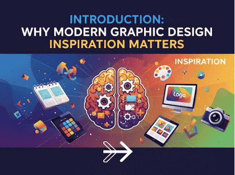
1. Introduction: Why Modern Graphic Design Inspiration Matters
Modern graphic design is constantly evolving. For designers, marketers, and brands, keeping up with fresh inspiration isn’t a luxury—it’s essential. Inspiration keeps designs fresh, helps communicate better, connects with audiences emotionally, and ensures your work doesn’t look dated.
As we move deeper into 2025, there are distinct visual trends, typographic shifts, and technological innovations shaping what “modern” looks like. This article explores those, and shows how you can use them—including through typeface/font choices—to level up your design work.
2. Key Trends Shaping Graphic Design in 2025
Here are major trends to watch, based on industry reports and creative communities:
2.1 Bold Typography & High Contrast
Typography is no longer just a helper—it’s often the hero. Designers are using oversized, bold sans Serif fonts, high contrast between text and background, dramatic pairings. This helps messages stand out in a saturated digital world. Venngage+2bittersweetcreative.com+2
2.2 Minimalist Meets Maximalist
A paradox: clean layouts + bold elements. Minimalist structures (lots of white space, limited color palettes, simple geometry) are paired with maximalist flourishes: rich textures, layering, vivid color pops, complex illustrations. The balance is dynamic. Venngage+2Yes I’m a Designer+2
2.3 Retro & Nostalgic Revival
Expect to see vibes from ’70s, ’80s, ’90s: neon hues, vintage color palettes, chromed metallic effects, grainy textures. But modernized—cleaner lines, updated color schemes—to avoid looking like a direct throwback. Philip VanDusen+2Adobe+2
2.4 Organic Shapes, Fluid Forms & Texture
Rigid grids are being softened. Designers are using fluid, organic shapes; overlays; textures like grain, paper, natural materials; even imperfections to bring warmth and tangibility to digital designs. Yes I’m a Designer+1
2.5 AI, Customization, and Inclusive Design
Tools powered by AI are helping with ideation, layout, even typography pairing. Also, there is increased attention to inclusive design (legibility, accessibility, representation), and customization—designs that adapt to user needs or brand voice. Venngage+2Adobe+2
3. How to Draw Inspiration Without Losing Your Brand Voice
- Audit your core identity: What defines your brand—values, personality, audience? Ensure that any trend you adopt reinforces rather than contradicts that.
- Mood boards: Collect visual assets—color, texture, fonts, layouts—that feel aligned.
- Selective adaptation: Choose one or two trends per project instead of trying to use all.
- Testing: Prototype, get feedback, ensure readability, especially if using bold or experimental typography.
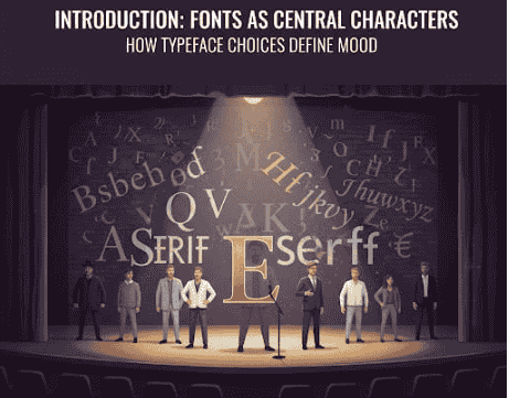
4. Fonts as Central Characters: How Typeface Choices Define Mood
Fonts are more than text. Choosing the right typeface affects tone, emotion, readability, and brand personality. Some roles typefaces play:
- Headline impact: For big titles, use bold or display fonts that attract attention.
- Body readability: Even in modern designs, body text needs clarity—legible serif or sans serif, appropriate line spacing.
- Contrast and pairing: Mix fonts (e.g., display + clean text) but maintain harmony.
- Texture and style: Distressed, textured, serif–sans serif hybrids can evoke nostalgia; smooth, geometric sans serif feel futuristic.
5. RaisProject’s Font Picks That Align with Modern Trends
- Break Sucker Display Font – Bold and edgy, ideal for strong headlines.
- Wac Man Display Font – Retro arcade-inspired, perfect for nostalgic vibes.
- Glitch Zone Display Font – Futuristic and experimental, great for tech-inspired layouts.
- Legend Hunter Font – Strong and adventurous, fitting for branding and posters.
- Dariena Floralie Font – Elegant with floral accents, perfect for modern yet decorative designs.
Example usage:
“Bring futuristic energy with our Glitch Zone Display Font.”
“For a nostalgic twist, try Wac Man Display Font that revives the retro arcade spirit.”
6. Practical Tips: Applying Inspiration to Your Next Design
Here are strategi praktis:
- Start with the message: what mood / feeling yang ingin disampaikan? Modern? Nostalgic? Techy? Organic?
- Select 1-2 dominant fonts: satu untuk headline / display, satu untuk teks isi. Pastikan keduanya kontras tapi harmonis.
- Color palette: gunakan warna netral dan satu atau dua aksen warna cerah atau metalik bila sesuai.
- Layout: manfaatkan white space; pertimbangkan grid modular tapi juga area bebas untuk bentuk cair (fluid shapes) atau stikering tekstur.
- Texture / finish: bisa tambahkan grain, noise, overlay, shadow ringan supaya desain tidak terlalu flat.
- Accessibility: cukup ukuran font; kontras warna; serif/sans serif sesuai konten; pastikan desain responsif di berbagai ukuran layar.
7. Conclusion
Modern graphic design inspiration isn’t about blindly chasing gimmicks—melainkan memilih elemen yang memperkuat brandmu, resonan dengan audiens, dan konsisten dalam kualitas. Dengan menggabungkan tren seperti bold typography, retro revival, fluid shapes, dan font yang kuat, kamu bisa menciptakan karya yang terasa segar, relevan, dan berdampak. RaisProject menyediakan banyak font yang bisa menjadi bagian dari perjalanan kreatifmu—gunakan dengan bijak, dan biarkan desainmu berbicara.
References / Further Reading
- Graphic Design Trends for 2025, Adobe Express.
- 10 Graphic Design Trends That Will Dominate 2025, Venngage.
- Graphic Design Styles: A Visual Guide From Modern to Contemporary, Looka.